At Builder, we are performance-obsessed. We have to be. In e-commerce, lost seconds equal lost sales. So, how do we generate code to meet our rigorous performance standards? Read more to find out.
Images are often the biggest contributor to total bytes downloaded on a page. This can cause slow experiences for visitors to your website, especially those on mobile devices. Luckily, there is a lot that can be done to optimize images and, interestingly, Builder's visual no-code platform can optimize images even more than many code frameworks themselves.
One excellent technique for optimizing images is to use next-gen formats like webp to serve the image. Unfortunately, the webp format is not supported by all web browsers, meaning that we can't just reformat all images to be webp and call it a day. However, the good news is that by using the HTML picture tag we can serve the correct optimized format for every web browser, falling back to other formats for those that don't support webp.
<picture>
  <source srcset="..." type="image/webp">
  <img srcset="...">
</picture>Next, using srcset is imperative. It is used to tell the browser what size image it should download (e.g. small sized for a mobile device). In combination with a dynamic image delivery API, you can ensure that you never load an image larger than needed. Using srcset also ensures that the best image is chosen based on device size and pixel density, not just device size.
<picture>
  <source
    srcset="
      https://cdn.builder.io/api/v1/image/...?width=100 100w,
      https://cdn.builder.io/api/v1/image/...?width=200 200w,
      https://cdn.builder.io/api/v1/image/...?width=400 400w,
      https://cdn.builder.io/api/v1/image/...?width=800 800w,
     ..."
    type="...">
  <img srcset="...">
</picture>This is a big one most developers and code frameworks miss. Unless you specify the sizes attribute on an image tag, the browser will assume your image is the entire width of the page. Yikes! That is often not the case, and can lead to fetching of excessively large images.
Creating the proper sizes attribute for every image on your site can be a tedious and time consuming process. Luckily, Builder analyzes your image as it relates to the layout of your page and determines the exact sizing of your image for all device sizes, automatically generating the optimal sizes attribute.
<picture>
  <source srcset="..."  type="...">
  <img srcset="..." sizes="(max-width: 400px) 95vw, (max-width: 900px) 50vw, 800px">
</picture>Lazy loading is another critical image optimization technique. There is no reason a visitor should download all the images of a page right when it loads. They might not even scroll far enough to see them all, so why waste the bandwidth? We should always wait until someone actually needs to see the image before loading it in their browser.
Traditionally, people would use Javascript scroll handlers and expensive layout calculations to determine when to load an image, which comes with their own set of problems. Luckily, modern browsers allow for the use of the IntersectionObserver API, which makes lazy loading images much more performant than it used to be.
const observer = new IntersectionObserver(callback, {
    root: document.body,
    rootMargin: '0px',
    threshold: 0 // display immediately when even 1px is visible
});
On top of that, you only want the below the fold images lazy loading. The content immediately visible on the page when landing will have a much better perceived performance if it loads immediately.
Builder accomplishes this with the same responsive page layout analysis described in the sizes section above - we automatically flag which images are below the page fold for each device and need to be lazy loaded.
Aditionally, for modern browsers, we take advantage of native image lazy loading.
<picture>
  <source ...>
  <img loading="lazy" ...>
</picture>Rendering below the fold content can be costly–both in layout time and paint times. Builder automatically flags below the fold content with content-visibility and content-intrinsic-size calculated from the content's real world layout dimensions per breakpoint.
.below-the-fold-section {
  content-visibility: auto; /* Don't layout or paing until in view */
  contain-intrinsic-size: 415px; /* Real world calculated size for each breakpoint */
}

@media (max-width: 960px) {
  .below-the-fold-section {
     contain-intrinsicis-size: 215px; /* Real world size of this breakpoint */
  }
}When a page loads, you only want the bare minimum CSS, HTML, and Javascript needed to load the content.
However, most applications have global CSS and Javascript that load regardless of if any content would use that CSS or Javascript.
Builder, by contrast, aggressively splits code and ensures when loading a page or component that only the absolute needed CSS, Javascript, and HTML is included.
<style>
  .box { /* ... */ }
  .text { /* ... */ }
  .button { /* ... */ }
  .h1 { /* ... */ }
  .h2 { /* ... */ }
  .h3 { /* ... */ }
  .h4 { /* ... */ }
</style>

<div class="box">
  Hello world!
</div>
→
<style>
  .box { /* ... */ }
</style>

<div class="box">
  Hello world!
</div>Builder serves minified, gzipped, and deduped CSS, Javascript, and HTML.
The deduping part is particularly interesting, as Builder has no notion of CSS declaration order dictating style precedence. This means we can more aggressively combine styles.
.my-box {
  display: flex;
  flex-direction: column;
  align-items: center;
  /* ... */
  font-size: 15;
}

.my-modal {
  display: flex;
  flex-direction: column;
  align-items: center;
  /* ... */
}
→
.my-box, .my-modal {
  display: flex;
  flex-direction: column;
  align-items: center;
  /* ... */
}

.my-box {
  font-size: 15;
}
The above example may look simple, but when taking into account large amounts of styles, the savings can be very significant.
All Builder content is fully server-side serializable to HTML. This means we can pre-render all content to optimized HTML, and remove all blocking scripts or styles. This way we can deliver content as very lightweight HTML and lazily load any additional JS, CSS, etc. for interactive elements which are hydrated after initial load.
We do this in a modern style similar to Gatsby, Next.js, and Nuxt - and can work within any of those frameworks (and others!) natively as well.
<!-- Blocking JS requiring download to make page visible -->
<script src="..."></script>
<!-- Blocking CSS requiring download to make page visible -->
<link rel="stylesheet" href="...">
<div>
  <button>Click me!</button>
  <div class="my-modal">
    <!-- Modal contents -->
  </div>
</div>
→
<style>/* Minimal above fold CSS */ </style>
<div>
  <button>Click me!</button>
</div>
<!-- Non-blocking lazy script -->
<script async src="..."></script>A very powerful feature of Builder is targeting and segmentation - showing different content to different audiences. We support this server-side optimized for various frameworks and platforms. For instance, for Shopify we generate code like:
{% if !customer.accepts_markering %}
  {% comment %} Sign up for newsletter modal {% endcomment %}
  {% render 'content.abc123.builder' %}
{% elsif now > 1601672082 %}
  {% comment %} Date targeted promotion {% endcomment %}
  {% render 'content.abc123.builder' %}
{% else %}
  {% comment %} General content {% endcomment %}
  {% render 'content.abc123.builder' %}
{% endif %}
Most split testing tools impact performance, as they need to first determine which variation of content to deliver to the visitor before the page can load. Builder A/B tests, on the other hand, do not impact performance in any significant way.
Our A/B testing runs server-side. We are able to do this because Builder can control whole sections of content, including using your custom code components.
As opposed to traditional A/B testing tools which block content load and jam in Javascript, Builder generates each variation server-side, and has a tiny inline script to dice out only the assigned variation to its appropriate traffic.
Thanks to gzipping, all overlapping content deflates away in the compression serving a very optimized and fast page with little added weight, regardless of the amount of test groups.
This means that even though multiple pieces of content are sent with the initial HTML, they are heavily duplicative, which means your page will not be 200% larger for 2+ test groups, it'll generally only be about 5-10% larger, regardless of the number of test groups, due to how gzip deflation deduplicates redundancies.
This is supported for all frameworks, including static frameworks like Gatsby and Nuxt.
Yes, you read that right. Dynamic content built statically: different users seeing different content on a static site.
<div data-builder-variation-id="a">
    Variation A
</div>
<template data-builder-variation-id="b">
   Variation B
</template>
<script>
  var isInTestGroup = Math.random() < 0.5;
  /* In practice, we also check/set a cookie to make the test sticky */
  if (isInTestGroup) {
    var self = document.currentScript;
    var testVariation = self.previousElementSibling
    var defaultVariation = testVariation.previousElementSibling;
    defaultVariation.innerHTML = testVariation.innerHTML
  }
</script>Our core philosophy is everything we offer must be a 0 cost abstraction–that is, every feature must come with no performance cost.
One of the most interesting features we offer along this principle is heatmaps.
Other heatmap providers are known for having performance problems. This is because they download large Javascript bundles and have to capture your entire page (HTML, CSS, assets, etc.) and send it to their backend. This is how they know the structure of the page and where all interactions occurred.
Builder takes a fundamentally different approach. In our case, we know the structure of your content already. On top of that, every layer in Builder content has a unique ID associated with it. This prevents us from having to do any expensive operations on the client. All we need to do is send a tiny JSON object back that just says what layer was clicked.
contentRoot.addEventListener('click', e => {
  // In practice, we also throttle and batch these
  fetch('https://builder.io/api/v1/track', {
     method: 'POST',
     body: JSON.stringify({
        event: 'click',
        element: e.target.getAttribute('builder-id'),
     })
  })
}, { passive: true })
In addition, our analytics API uses edge compute to terminate the request at the CDN and respond immediately, generally in less than 30ms.
Builder works natively with many frameworks, and support all frameworks with our various APIs and SDKs.
You can even use your code components in the visual editor, and even limit editing to require only using those to enforce design systems and standards.
And most importantly, we keep our SDKs small and mighty. Some example sizes:
React SDK:

Vue SDK:

Qwik SDK:

We have also created an open-source project called Mitosis that shares how we compile fast and idiomatic code for any framework (React, Vue, Svelte, Liquid, etc.).
Builder serves code dynamically over our various APIs. This ensures code is only loaded as needed, and can likewise be segmented and A/B tested using edge compute (serving from an edge CDN but different visitors still get different results).
We also use stale-while-revalidate caching at the edge to make sure average response times are under 50ms, while still being fresh up to the second!
No-code tools don't have to mean slow-code tools. In fact, the very opposite can be true. Defining code in a declarative JSON-based format with a visual editor and framework-specific code optimizing renders and compilers can actually mean significant performance gains.
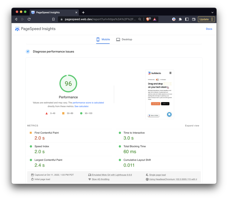
Still don't believe us? Check out the performance of this site that is built entirely in Builder.io:
Tip: Read the explainer guide on SEO Core Web Vitals.

And did we mention our open source work to make the web faster for all sites:


