I've always wanted the web to win, full stop. When I compared the web experience to mobile apps, however, it always felt like the web was losing. After all these years, the web still feels like a collection of documents linked without delight or an excellent user experience. Don't get me wrong, with the CSS evolution in full swing; we got many new and useful features, but it was still missing an easy-to-use API to animate, move, and even morph elements into each other…
Even simple animations like the ones below required wild and unmaintainable CSS hacks or heavy JavaScript animation libraries.
For those rooting for the web, 2025 has now exciting news! Both Chrome and Safari shipped a new and fairly straightforward way to add animations and transitions to your sites — say “Hello” to the View Transitions API.
Let me show you how view transitions work by recreating this animation effect with a few freckles of modern web technology. A web technology that is probably the most significant web platform update in years.
Whenever I want to quickly sketch something out (like the code for this blog post), I reach for Builder's Visual Copilot. Design something in Figma, import the design into Builder using the Figma plugin, and off you go.
With a single command, you'll be ready to pull your codified design into your codebase.
Pure HTML, React, and even Swift exports are available to give you a headstart. It's pretty sweet!
But let's get to some animation magic.
To explain the view transition core concepts, we'll use a vanilla approach to rebuilding this animated navigation — HTML, CSS, and good old JavaScript to toggle an active class.
That will be it; there won't be animation libraries or other external dependencies. All included concepts can be applied to sites built with or without frameworks.
If you're wondering how to apply view transitions to your React, Vue, or Angular app, you'll find resources on web.dev.
So, where do we get started?
Here's the HTML we'll use:
<main>
  <nav>
    <a href="#" class="active">Home</a>
    <a href="#">Projects</a>
    <a href="#">About</a>
  </nav>
</main>
Nothing fancy — it's just a list of links.
And here's some basic JavaScript to toggle the active class on all the included navigation links on click.
const allLinks = document.querySelectorAll("a");

allLinks.forEach((link) => {
  link.addEventListener("click", (event) => {
    setActiveItem(event.target);
  });
});

function setActiveItem(element) {
  allLinks.forEach((link) => link.classList.remove("active"));
  element.classList.add("active");
}
The CSS will be pretty common stuff, except for the background of the active link element. The active link’s background isn’t rendered on the link itself but rather a pseudo-element. We'll need this extra pseudo-element to animate and slide it around later on.
a.active::before {
  content: "";
  position: absolute;
  inset: 0;
  background-image: linear-gradient(to right, #6a11cb 0%, #2575fc 100%);
  z-index: -1;
}
Here's a live preview of how the project looks so far:
So, what are they — these view transitions? Here's what MDN has to say about them:
The View Transition API provides a mechanism for easily creating animated transitions between different website views. This includes animating between DOM states in a single-page app (SPA), and animating the navigation between documents in a multi-page app (MPA).
View transitions allow you to take screenshots of DOM elements, then modify the DOM and magically transition from the old view to the new DOM representation.
In this article, we'll cover the animation between different DOM states triggered via JavaScript (the SPA mode), but we will cover cross-document transitions in the future here on the blog. Check the newsletter box in the footer if you want to catch the next article.
But let's get started, and I'll explain the concepts along the way. At the core of view transitions is the startViewTransition JavaScript method.
Here's the getting-started example snippet from the view transitions web.dev guide.
function handleClick(e) {
  // Fallback for browsers that don't support this API:
  if (!document.startViewTransition) {
    updateTheDOMSomehow();
    return;
  }

  // With a View Transition:
  document.startViewTransition(() => updateTheDOMSomehow());
}
To animate between DOM states, you pass a callback function to startViewTransition that modifies the DOM. You could add new DOM nodes or add or remove classes; either way, the browser will transition between the old and new DOM states.
A quick note about browser support: Safari and Chromium support the new API at the time of writing, and I recommend treating view transitions as a progressive enhancement. Chromium and Safari (90% global share) users will then see the new and fancy web. For me, that's good enough, and I bet the rest won't miss it.
Luckily, view transitions support is easy to detect. If document.startViewTransition is available on the document object, you can use the API to create transitions and animations. If it's not, you update the DOM as usual, and people on older browsers or Firefox won't see smooth transitions. In my opinion, that's a good trade and better than loading tons of JavaScript for everybody.
Let's add startViewTransition to our example.
const allLinks = document.querySelectorAll("a");

allLinks.forEach((link) => {
  link.addEventListener("click", (event) => {
    // Fallback for browsers that don't support this API:
    if (!document.startViewTransition) {
      setActiveItem(event.target);
      return;
    }

    // Update the DOM with a view transition
    document.startViewTransition(() => setActiveItem(event.target));
  });
});
The code is now similar to the initial example; the only change is that setActiveItem is now called by startViewTransition if the browser supports it.
And look at this, with this minor tweak, we already see a cross-fade happening for the active element:
Pretty cool, right? But what's going on, and how does this work?
The browser will attach new pseudo-elements to the DOM whenever you start a new view transition. You can see these elements in the Chrome dev tools while a view transition is happening.
Above, you see Chrome's animation tooling (you can open it with CMD+Shift+p and search for “animation”) that I use to debug the triggered view transition. Thanks to the animation tooling, we can see the view transition pseudo-elements in the DOM and even slow down the animations. Very handy!
::view-transition-old() is a screenshot of the old DOM state whereas ::view-transition-new() is a live representation of the new DOM state. The old DOM screenshot is then transitioned to the new live DOM presentation. By default, this is done with a fade and mix-blend transition. But what are we transitioning here?
If you look closely, you see that by using startViewTransition, the browser will take the root element (the html element) take a screenshot of it, and fade to the newly updated HTML DOM state. Just like that? Yep, you can add cross-fade transitions to your sites with a JavaScript one-liner.
That's fun, but why stop there? Let's build up our navigation component and animate more than the root element.
When we look at our target components from the beginning, we want to animate the active nav element separately. How can we achieve this?
For these use cases, we can specify in CSS that we want to have another animation group with the view-transition-name property.
/* Move the active link into its own view transition layer */
a.active {
  view-transition-name: active-nav-elem;
}
And look at this: this animation effect isn't quite what we're after, and it's not perfect yet (notice this small visual glitch), but it's quite impressive for a single line of CSS.
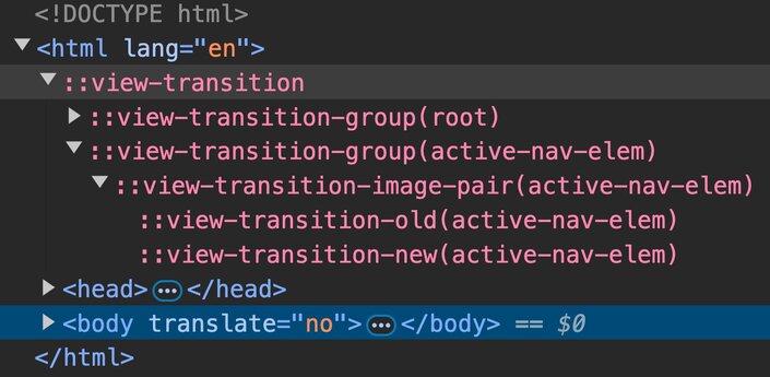
If you inspect the DOM, you'll discover that there are more view-transition- pseudo-elements.

View transition pseudo-elements rendered in the DOM.
We still have the view transition elements for root, but there are now also elements for our active link (active-nav-elem), which was put into its own group by applying the view-transition-name property.
The ::view-transition-group(active-nav-elem) transitions the elements’ positioning, transform, width, and height properties. Remember, it's a screenshot of the old active link and a live presentation of the new active link, and the browser transitions from one to the other. It doesn't matter that transitioning active links are completely different DOM nodes. The browser will just figure it out and visually morph one element into the other. Wild!
What you see above is that the active link view transition is rendered above on top of a cross-fade root view transition. That's why it looks like links are fading away under the active element, but, in practice, it's the entire root element doing a cross-fade. Pretty cool, right?
Next, let's fix this visible glitch in the active element transition.
The problem is that the transition group tries to transition two elements with different dimensions and aspect ratios. The “Home” link is smaller than the “Projects” link.
To smoothen the transition, we can target the two pseudo-elements in CSS, tweak the animation, and define that they both should match in height while still doing the cross-fade.
/* Apply the same height to ease the view transition */
::view-transition-old(active-nav-elem),
::view-transition-new(active-nav-elem) {
  height: 100%;
}
Isn't this cool?
Even though it looks pretty fancy already, this isn't the effect we are looking for. How could we make the highlighted gradient box slide under the text?
Do you remember that the background gradient was done with a ::before pseudo-element instead of setting a background on the active link? Now that we know about the view-transition-name property, we can animate the pseudo-element instead of the entire link.
/* Move the background to its own view transition layer */
a.active::before {
  view-transition-name: active-nav-elem;
}
And again, this doesn't look too bad for such a tiny change. Does it?
But the background view transition is now covering the text fragments. How can we move the text on top of the ongoing background transition?
We can put all the links into their own view transition layers and control all the view transition pseudo-elements with a z-index!
This could be done right in CSS…
/* Move all the links into their own view transition layer */
a:nth-child(1) {
  view-transition-name: nav-1;
}

a:nth-child(2) {
  view-transition-name: nav-2;
}

a:nth-child(3) {
  view-transition-name: nav-3;
}
…and this kind of works, but if you use a templating engine or a framework, you're better off defining the view transition names in HTML with inline styles. It's more maintainable and will guarantee that you don't need to touch your CSS if you update the number of navigation items.
<main>
  <nav>
    <a href="#" class="active" style="view-transition-name: nav-1;">Home</a>
    <a href="#" style="view-transition-name: nav-2;">Projects</a>
    <a href="#" style="view-transition-name: nav-3;">About</a>
  </nav>
</main>
This looks better, but still not quite right.
When navigating forward, the background is placed under the text fragments, but you still see the background covering the text when going backward. Why's that?
We didn't apply the z-index to all our view transitions yet!
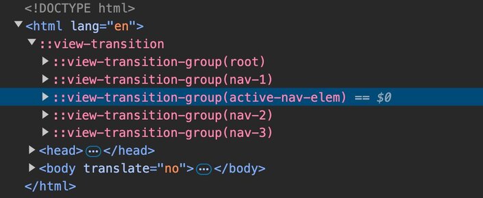
By default, view transitions are stacked on top of each other depending on where they are defined in the DOM. If the active link pseudo-element is first in our navigation, the view transition pseudo-elements look as follows.

View transition pseudo-lements highlight in DevTools. The ::view-transition-group(active-nav-elem) is highlighted on third position.
We have the first text link (nav-1) and then the pseudo-element on top of it. And going on, the nav-2 and nav-3 text elements are on top of the background pseudo-element.
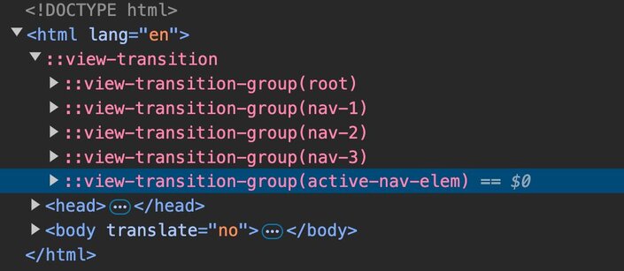
If we transition from the third link being active, the active-nav-elem transition layer comes last and covers all the text links when it transitions.

View transition pseudo-lements highlight in DevTools. The ::view-transition-group(active-nav-elem) is highlighted on last position.
We need to apply a z-index to our text layers to fix this. But how?
To apply custom styles like the z-index to the transition layers, we can target the transition groups in CSS.
/* Stack the text over the animated background */
::view-transition-group(nav-1) {
  z-index: 1;
}
::view-transition-group(nav-2) {
  z-index: 1;
}
::view-transition-group(nav-3) {
  z-index: 1;
}
But hold on, isn't this the problem of having a hardcoded number of items in our CSS? That's correct, and there's a solution, but I wouldn't recommend using it in production yet.
You could rely on the view-transition-class property to target multiple view transition pseudo-elements, but its browser support isn't great yet (Chromium and recent Safari). MDN doesn't even have a docs page for it.
View transition classes work similarly to “normal” classes. Give multiple elements the same view transition class and target the resulting layers with the view-transition pseudo-element selectors.
/* Define a view transition class to target multiple view transition layers */
a {
  view-transition-class: nav-item;
}

/* Apply styles to multiple view transition layers */
::view-transition-group(.nav-item) {
  z-index: 1;
}
If you're on Chromium or a recent Safari, here's the fixed stacking context with cutting-edge CSS.
So, as of now, I recommend hardcoding the view transition layers until view-transition-class has better browser support. It’s not pretty, but it's not too bad, either. This article is excellent if you want to read more about view transition classes.
There's one last bit of fanciness I want to add, though!
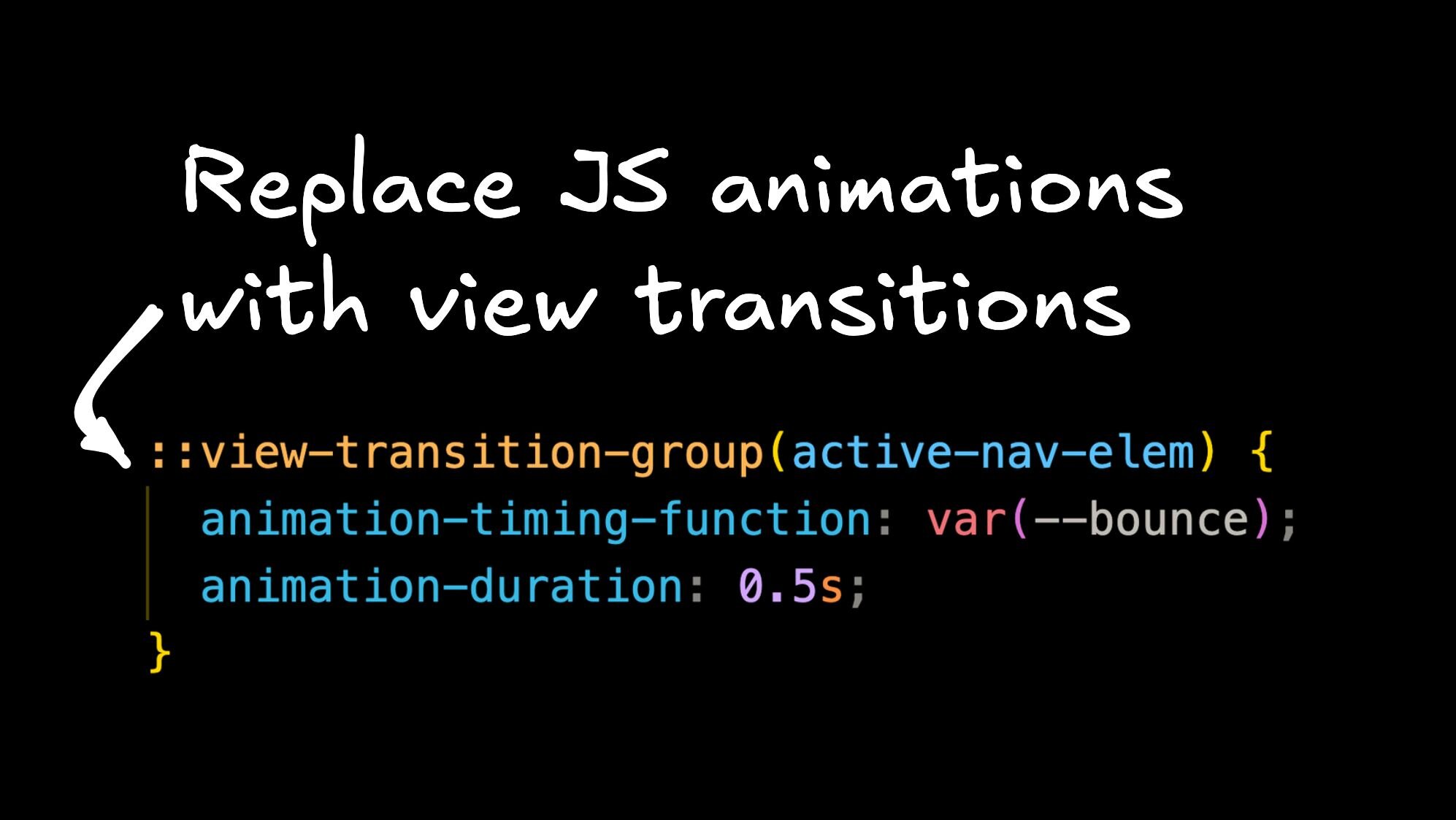
The background pseudo-element is now smoothly sliding below all the text links and it's looking pretty good, but I think it could look a bit more fun. Let's make it bounce and apply some custom easing functions to the transition group, that's wrapping the background element.
Remember, view transitions are all about CSS; we can go in, apply a custom easing function, and even control the time of our background element transition.
:root {
  --bounce: linear(
    0,
    0.271 8.8%,
    0.542 19.9%,
    0.837 34.2%,
    1 44.7%,
    0.943 51.1%,
    0.925 57.5%,
    0.937 63.1%,
    1 77.4%,
    0.991 84.2%,
    1
  );
}

/* Tweak the active background animation */
::view-transition-group(active-nav-elem) {
  animation-timing-function: var(--bounce);
  animation-duration: 0.375s;
}
If you haven't seen the linear() easing function yet, it allows us to create bouncy effects like the one below. You probably don't want to code these by hand, however, which is why I recommend using the Easing Wizard.
And now, look at the final result!
I don't know about you, but I'm pretty excited about all this!
Quick side note: if you now go ahead and create animations heavily moving DOM elements around, be a good web citizen, and allow people to opt-out by using @media (prefers-reduced-motion) {}.
View transitions allow us to finally push the web to the next level and I'm so there for it!
I hope this small example shows the power of the new View Transitions API. We needed roughly 50 lines of CSS to build something that would usually require thousands of lines of JavaScript locking your CPU. The future is bright (and animated).
If you want to learn more about view transitions, let us know in the comments, shoot me an email, or tag us on social. If we get great feedback, we'll publish more articles on the matter soon. Oh, and make sure to subscribe to our newsletter below if you want to catch more articles on this topic.
Until then — have fun dropping some heavy animation libraries from your code bases!

Builder.io visually edits code, uses your design system, and sends pull requests.
Builder.io visually edits code, uses your design system, and sends pull requests.


 Connect a Repo


