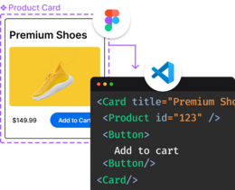
Updating the same UI components across hundreds of screens is a pain. But there's a better way - Figma components make updating design elements as easy as changing one master copy.
Let's dig into how components work and how to use them effectively.
Components are reusable design elements - think buttons, cards, navigation bars - that you can use across your designs. They work like this:
- Make a master component (the original)
- Create instances (copies) wherever you need them
- Update the master to change all instances at once
Pretty neat, right?
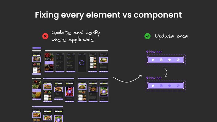
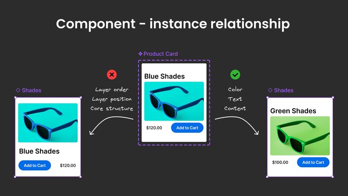
Not everything in a component instance can be changed. Here's what you're working with:
Can't change:
- Order and position of layers
- Constraints on the layers
- Core structure
Can change:
- Colors
- Text content
- Text properties
- Effects
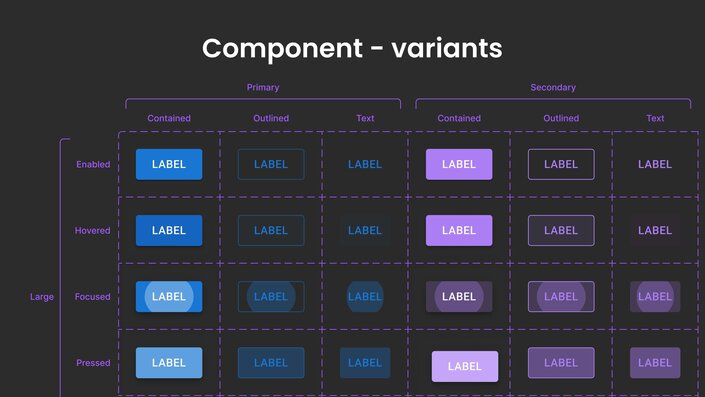
Variants: Figma components that do more
Sometimes you need different versions of the same component. That's where variants come in.
Take a button component — you might need:
- Color (Property) — Primary, Secondary (values)
- State (Property) — Focused state, Hover state (values)
Instead of creating separate components, variants let you handle all these states in one place.
It's super straightforward:
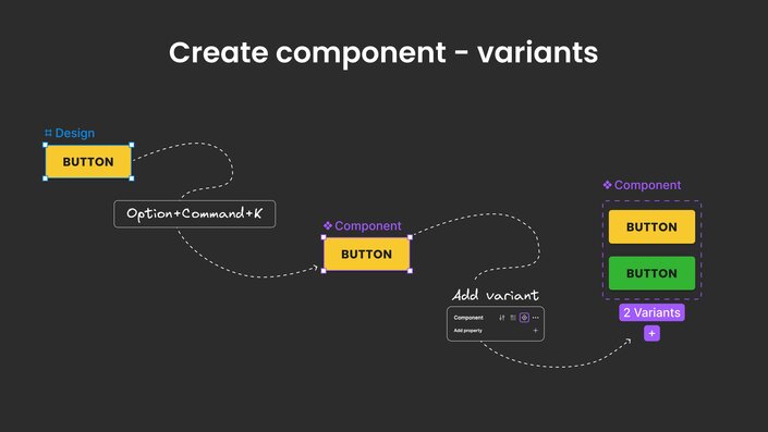
- Select your design element.
- Press
Option+Command+Kor right-click > Create component or click […] on the Properties panel on the right > Create component. - You can click Create Multiple components to create components in bulk by selecting many design elements.
For variants:
- Use the Properties panel on the right > Add property.
- Right-click > Main component > Add Variant.
- Or select multiple elements > Create Component Set.
How to use Figma components in your designs
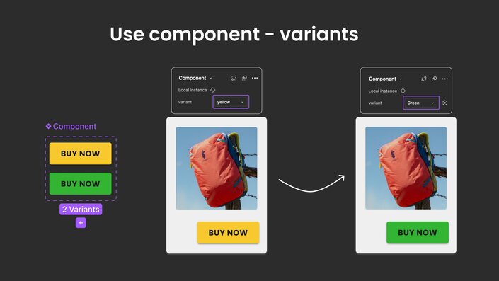
- Drag the component from the Assets panel on the left sidebar.
- Or copy the component (master) and paste it (instance) into your frame.
- Swap between instances from the Properties panel on the right.
When should you use Figma components?
Components are perfect for:
- Stuff you use over and over
- Elements that might change later
- Building design systems
Keep it simple but clear. You don't need a novel — just enough to know what it is.
Your component names should make sense at a glance in the format Component/Value of the property
✅ Do this:
Card/BlogButton/PrimaryInput/Search
❌ Not this:
ButtonV2FinalNewCardUpdatedComponentSet47
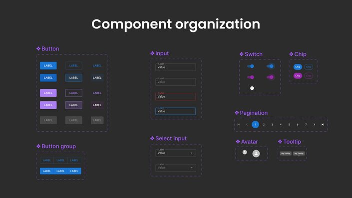
Think about how your team will use these components. Group related stuff together:
- Keep navigation components in one section
- Forms and inputs in another
- Common UI elements together
When you're building a design system that needs to scale, multi-dimensional component sets in Figma are a game-changer. They're not just a neat Figma trick — this approach mirrors how popular component libraries like Material-UI (MUI) handle variations.
Here's the idea: instead of creating a ton of individual components, you use properties to define different dimensions of variation. Let's break it down with a button example:
- Property 1: Style (Primary/Secondary)
- Property 2: State (Default/Hover/Disabled)
- Property 3: Size (Small/Medium/Large)
This is much cleaner than having 18 separate components floating around.
✅ Do this: Button/Outlined/Primary/hover
❌ Not this: Button/PrimaryOutlinedonHover
Managing changes in Figma components (without breaking everything)
Here's the thing about components — changes can affect a lot of designs at once. That's powerful, but it can also be scary.
Some tips to avoid disasters:
- Let your team know before pushing big changes.
- Test changes on a few instances first.
- Consider adding new variants instead of creating a new component/ set.
- Only detach instances when you absolutely have to.
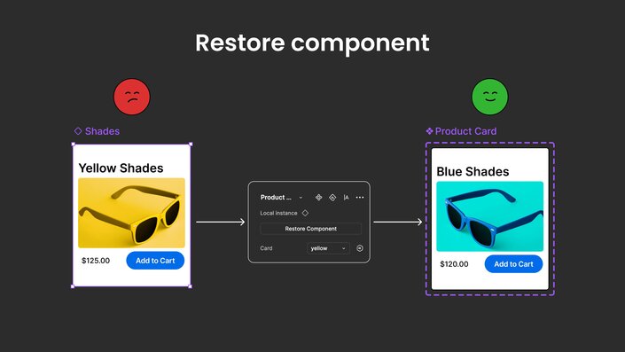
If you accidentally delete a master component, don't panic. As long as you have one instance left, you can restore the whole thing.
When to break the rules with Figma components
Sometimes you need to detach an instance from its master. That's fine, but try these first:
- Add a new variant.
- Use component properties.
- Override specific attributes.
Only detach if none of those work. Why? Because detached instances don't get updates from the master component anymore.
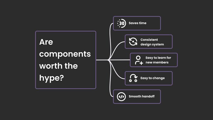
Components aren't just about keeping things organized. They:
- Save tons of time on updates
- Keep your design system consistent
- Make it easier to experiment with changes
- Help new team members understand your design system
- Make handoff to developers smoother
If you're using Builder’s Visual Copilot Figma plugin, you can leverage the component mapping feature to create a direct link between the design components in your Figma file and their corresponding code components ensuring a consistent output in your projects. Going from Figma to code should not just be about translating designs into code; it should be about translating them into your code.
Figma Components might seem like extra work at first, but they're worth it. Start using them in your next project — even if it's just for buttons and cards. Once you see how much time they save, you'll never go back.
Remember: the biggest mistake with Figma components isn't using them wrong — it's not using them enough.
Want to learn more about turning your Figma designs into code? Check out our guide on Figma to code conversion.
Introducing Visual Copilot: convert Figma designs to high quality code in a single click.


