As a web developer, you're always looking for ways to improve your code and make your layouts more efficient.
One such improvement is the CSS Gap Property, which can simplify your web layouts and make them more visually appealing. Let’s explore the benefits of using the CSS Gap Property instead of margins, and how it can make your life as a developer easier.
Like a lot of things in software development, there are opposing opinions and camps for certain mehods and preferences. One of these cases is the use of CSS margin, either using only margin-top or using margin-bottom.
Nowadays, it’s better to use CSS logical properties and values, but the question of which strategy to use is only an opinion.
As many of you may know, the natural flow (or normal flow) of the DOM is top to bottom. That is to say, any block element will be placed below the preceding block and any inline block will be inline.
Check out the following example to better understand this concept:
That is why a lot of front end developers might prefer using margin-bottom as it feels more natural.
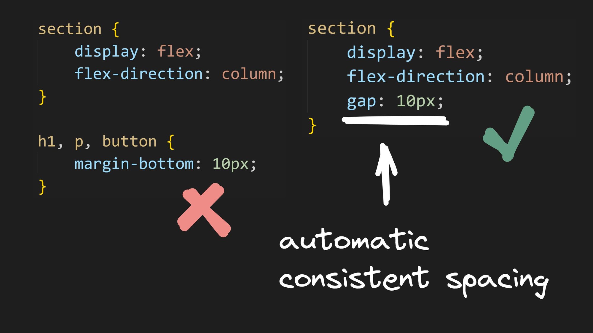
The CSS Gap Property provides several benefits to web developers looking to create visually appealing and organized web layouts. It simplifies layouts, improves readability, enables responsive design, reduces code complexity, and improves browser performance. The Gap Property defines the size of the gap between the rows and columns in flexbox, grid, or multi-column layouts. It is a shorthand for the row-gap and column-gap properties.
Using the CSS gap property instead of margins has several advantages:
- Simplifies layouts: Previously, developers had to use margin or padding to create space between elements, which could be time-consuming and result in inconsistent layouts. The CSS Gap Property eliminates this problem by providing a simple and efficient way to add space between elements without affecting their dimensions.
- Easier responsive design: Gap makes it easier to handle spacing in responsive designs without the need for complex calculations or additional wrapper elements.
- Reduced code complexity: Instead of using multiple CSS properties to create space between elements, you can use the CSS gap property to achieve the same effect with a single line of code.
- Better browser performance: The CSS gap property can improve the performance of your website by reducing the amount of code required to create space between elements. This can result in faster load times and better overall performance.
- No need for negative margins or pseudo selectors: Using the gap property doesn't require thinking about negative margins or using pseudo selectors to remove first or last element margins.
Steve explains this quite well in this video:
To better illustrate the differences between using the CSS gap property and margins, let's consider a minimal example with a flexbox layout:
<section class="margin-example">
  <div>Box 1</div>
  <div>Box 2</div>
  <div>Box 3</div>
  <div>Box 4</div>
</section>
.margin-example {
display: flex;
flex-wrap: wrap;
}
.margin-example div {
width: 200px;
margin: 0 10px;
background: rebeccapurple;
color: white;
}
.margin-example div:first-child,
.margin-example div:last-child {
margin: 0;
}Here’s the result:
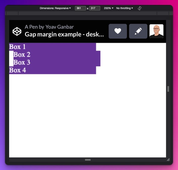
Depending on what device you are viewing this from, this might look broken to you, and you would be right. The corresponding margin code from above is only taking into account desktop sizes, and is adding (margin) spacing to the left.
As a result, the mobile display is broken, as can be inferred from the image below:

How can we fix this? We could add a media query to handle what happens on mobile sizes. The naive approach would be to just switch up the margin-left & margin-right to margin-top & margin-bottom values:
@media only screen and (max-width: 425px) {
 /* CSS styles for mobile devices */
 .margin-example div {
  margin: 10px 0;
 }
}
The result:
That still isn’t right, is it?
It’s also clunky in different screen sizes when we resize the viewport window as can be seen below:
When we get to our media query breakpoint things go awry. Suddenly, boxes change sizes, and when we do get to more of our mobile screen size our second and third box get more space between them than we might have expected.
We’d need to do more work to make the responsiveness right.
<section class="gap-example">
  <div>Box 1</div>
  <div>Box 2</div>
  <div>Box 3</div>
  <div>Box 4</div>
</section>
.gap-example {
 display: flex;
 flex-wrap: wrap;
 gap: 20px;
}

.gap-example div {
 width: 200px;
 background: rebeccapurple;
 color: white;
}
First off, using the CSS gap property results in cleaner and more concise code compared to using margins.
What about responsiveness? Have a look:
Responsive without hassle!
Let's say you have a grid layout with multiple elements:
<section>
  <div>Box 1</div>
  <div>Box 2</div>
  <div>Box 3</div>
  <div>Box 4</div>
</section>
To create a responsive design and add space between the elements, you can use the CSS gap property:
section {
  display: grid;
  grid-template-columns: repeat(auto-fit, minmax(200px, 1fr));
  gap: 20px;
}
This will create a 20px gap between the rows and columns, making the layout more visually appealing and easier to manage:
The CSS gap property is a powerful tool that can simplify your web layouts and make them more visually appealing. By using the gap property instead of margins, you can reduce code complexity, improve browser performance, and create more consistent and responsive designs. So, the next time you're working on a web layout, consider using the CSS Gap Property to make your life as a developer easier and your layouts more efficient.
Introducing Visual Copilot: convert Figma designs to high quality code in a single click.


