I’ve written before about how far CSS has come and how it has gotten way better in the past few years, as well as shared some tips to level your CSS game.
But this time of year is a great time to have a look at what a banger-year CSS had. Especially with projects like Interop 2023 and Baseline.
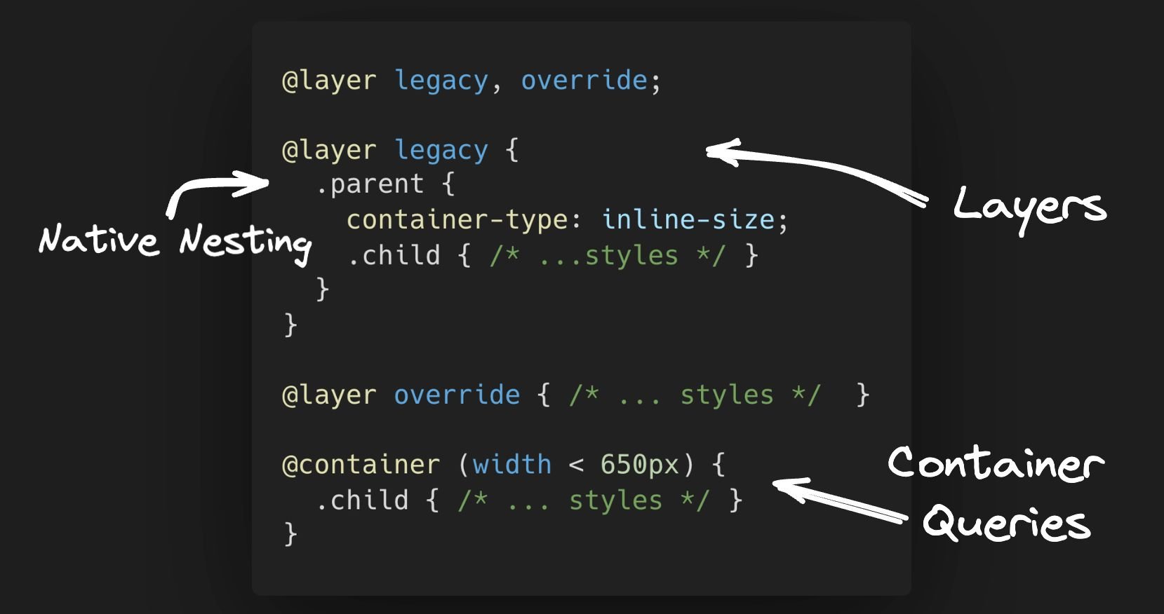
In this post, I want to focus on 3 features you can start using today. One will help you deal with legacy projects, the second can clean up your CSS code many folds, and the third will change the way you approach responsive design.
All of these features are supported in all modern browsers, so there’s no reason to not start using them today!
Let’s dig in.
To get something done that might be a real-world scenario, we need some design to work with. I’ve randomly selected this notification card from Loom:

I’ve added the design to Figma, as that’s usually where most UI work starts.
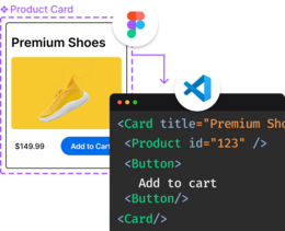
To save time, and not try and recreate this little UI nugget manually, I ran it through Builder’s Visual Copilot Figma plugin to make it generate the code for us.
You can find the code in this link. Also, you can scroll to the last section to see how I generated the code.
Notice the initial code above has some duplication for media queries. Some might like to just take out the CSS rules into one media query.
However, in the age of components, to me, it makes more sense to have each class of styles encapsulate how it should behave in different breakpoints under it.
Also, it would be nice to groups of children so we don’t need to have to use descendant combinators (.parent .child) selectors.
Native CSS nesting is now ready to help with such a task!
In the past, you’d need to rely on pre-processors such as SaSS or Less, but not anymore… Native CSS nesting has landed on all major modern browsers.
Here’s how we could refactor the code:
<article class="wrapper">
 <div class="content">
  <div class="column">
   <img loading="lazy" srcset="..." class="img" />
  </div>
  <div class="column">
   <div class="text">
    <p class="top">
     Record a loom to add a personal touch to your messages
    </p>
    <p class="bottom">
     Add a personal touch to your communication by sending a Loom. Discover
     all the ways you can use Loom
     <a href="#">
      here.
     </a>
    </p>
   </div>
  </div>
  <div class="column">
   <button class="rec-btn">Record now</button>
  </div>
 </div>
</article>
.wrapper {
/* ... styles */
@media (max-width: 767px) {
/* the styles specific for the beakpoint nested under the calss it affects */
}
}
.content {
/* ... styles */
/* nested children */
.column:nth-of-type(2) {
width: 44%;
}
.column:first-child {
padding: 0;
}
/* nested media query */
@media (max-width: 767px) {
flex-direction: column;
gap: 0px;
/* nested child affected by media query */
.column:nth-of-type(2) {
width: 100%;
}
}
}
/* ... more styles */See the full code in this Codepen link.
After running a character count (not including white spaces), without nesting I was at 975 characters vs with nesting which ended up being 868 characters (at least according to ChatGPT 😅).
It might not seem much with this small example but just think about a decent size project and how much less code and less complexity you can get.
It’s important to note that besides media queries and children of parents, you can nest:
- multiple
@mediarules @layer(more on that in a bit)@supports@scope(Currently only works on Chrome)@container(more on this below)
Before we got similar syntax to SaSS and Less styled nesting, native CSS nesting had to be done with an & character to explicitly state the relationship between parent and style rules.
Now with general availability in all browsers, you can choose whether to use it or just nest like the good ol’ days. However, it’s important to understand there’s a difference when not using it.
When using the & nested child selectors are relative to the parent element. Whereas, not using & makes you use the child rule selector is the one selecting the elements. That means the child rule selector has the same specificity as using :is().
For a deeper dive into nesting, I recommend going through the MDN docs, reading Adam Argyle’s post, and this post by Ahmad Shadeed.
The headline is somewhat true. It’s not to say that with @layer you can take a legacy project that is littered with !important changes one or two things and you’re off to the races, able to change styles with ease and add new things without worrying about breaking the existing styles.
However, it can come in handy instead of littering your codebase with !important.
The general idea of @layer is that you can decide on the order of the cascade. In other words, it can help you define the order of precedence in case of the multiple cascade layers.
Let’s have a look at a simple example to understand the syntax:
@layer module, state;

@layer state {
  .alert {
    background-color: brown;
  }
  p {
    border: medium solid limegreen;
  }
}

@layer module {
  .alert {
    border: medium solid violet;
    background-color: yellow;
    color: white;
  }
}
At the top of the file, we declare the layer order. The "state" layer is last and so, it will override the "module" layer. The rest of the code is just the different declarations for each layer.
So, in essence, we can utilize this to override styles in case of a legacy project, or even use it to apply one-off theming.
Let’s imagine our notification card from above is inside some sort of legacy project, to which we do have access to the CSS source.
Let’s also say that we have a new requirement to change the text size of the top section, the text color in the bottom section, and the color of the button.
What we could do in this case is the following:
/* Decide on the cascade layer order */
@layer legacy, new;

/* Add a "new" layer with the overrides we want */
@layer new {
 .text {
  .top {
   font-size: 1.5rem;
  }
  .bottom {
   color: rebeccapurple;
  }
 }
 .rec-btn {
  background-color: hotpink;
 }
}

/* wrap the legacy code with the layer name "legacy" */
@layer legacy {
 /* same code as before  */
 /* ... */
}
Pretty nice, no?
We used both nesting and layers. In the past, to achieve this we would have had to either fight with specificity or add a new stylesheet and make heavy use of !important.
CSS Container Queries are a game-changer in the world of responsive design, stepping beyond the limitations of traditional media queries.
Unlike media queries that base responsiveness on the viewport size, container queries allow styling based on the size of a parent container. This shift empowers developers to create more modular, reusable components that adapt seamlessly within different container contexts.
The benefits are clear: enhanced layout control improved component-based responsiveness, and simplified, cleaner CSS.
For instance, let’s take the use of our notification card example code. Using container queries, we can remove almost all of our media queries and dictate what needs to change if the card's width is below our threshold (692px which we arbitrarily decided, is the max-width for our card):
.wrapper {
 /* define the container type */
 container-type: inline-size;
 /* name the container (optional) */
 container-name: notification-card;
 border-radius: 16px;
 border: 1px solid rgba(108, 102, 133, 0.2);
 max-width: 692px;
 padding: 0.5rem;

 /* This media query was kept as you can't target the element which is the container */
 @media (max-width: 767px) {
  padding: 0.5rem;
 }
}

/* ... rest of the code is the same, only media queries removed from classes */

/* what changes once the container is below our threshold */
@container notification-card (width < 692px) {
 .content {
  flex-direction: column;
  gap: 0px;

  /* we can use nesting as well */
  .column {
   width: 100%;
  }
  .column:nth-of-type(2) {
   width: 100%;
  }
 }
 .img {
  margin-top: 40px;
  border-radius: 0;
 }
 .text, .rec-btn {
  margin-top: 40px;
 }
}In this example, .wrapper becomes a container, and we can target its child elements to adapt their layout based on the card's width, not the viewport. I don’t know about you, but to me this feels more in line with modern, component-based web development.
Of course, there are more things to know. For example, there are more keywords we can use besides (width < {value}).
For different logic, we can use the following:
and- allows combining 2 or more conditions (@container (width > 400px) and (height > 400px))or- likeandcan be used to combine conditions that apply when one is true. (@container (width > 400px) or (height > 400px))not- as the name suggests, negates the condition. Allowed only one time per query and can’t be used in combination withandoror.
Other than logical keywords, you can use different descriptors other than width, such as aspect-ratio, block-size, height, inline-size or orientation.
There are also special container query length units.
All it took was a few simple steps, that can be seeing in this video:
You can check out the initial output here.
Granted, it’s not perfect on the first go, but it was something to start with. We were able to convert Figma to HTML in just one click, how cool is that?!
After that, I copied it to Codepen.io, and tweaked it.
Visual Copilot automatically made all the code responsive, but it has made some weird assumptions and class naming here and there, (this is using the free “fast” code generation, which is getting better every day 🙂, and using the “quality” tab yields better results).
After that I’ve made a few changes like better class names, semantic tags, and fixed some responsive issues (you can see the cleaned up code in this Codepen link).
There you have it, 3 new CSS features to start using in the new year.
CSS has truly transformed into a mighty tool in the web dev arsenal, especially with these killer features.
Embracing the power of native CSS nesting and @layer can produce smarter, cleaner style sheets.
But the real showstopper? CSS Container Queries. They're rewriting the rules of responsive design, making our lives as devs a whole lot easier. No more wrestling with media queries for every little tweak. Just set your container's size and watch as your components adapt like magic.
It's not just about writing less code; it's about writing smarter, more efficient code.
The future of web design is looking pretty darn exciting, and we're just getting started! 🚀💻🎨
What do you say? Would you start using these in your projects?
Introducing Visual Copilot: convert Figma designs to high quality code in a single click.


