We pride ourselves in creating simple, intuitive tools that enable both technical and non-technical people to build rich digital experiences.
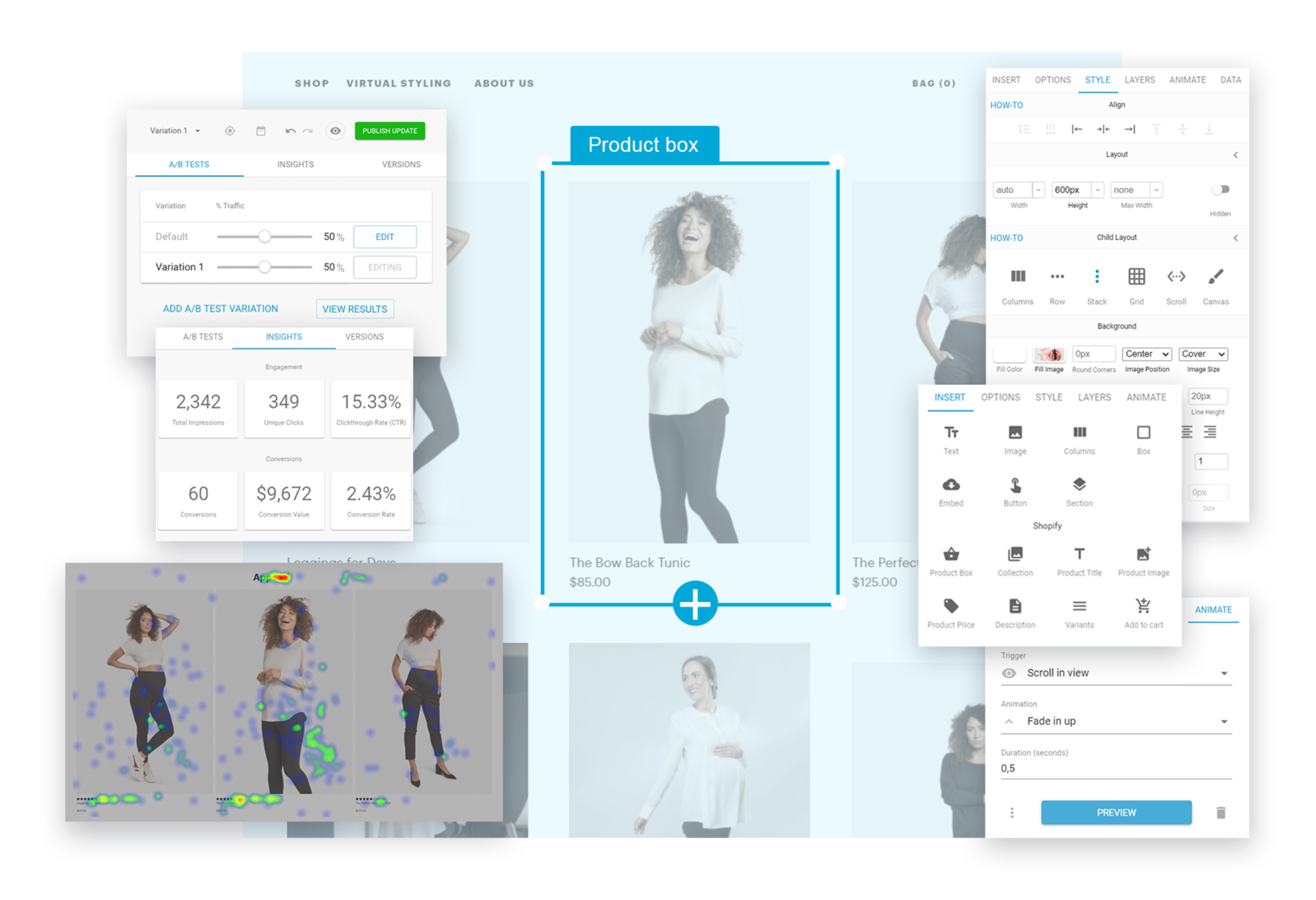
Today, the most powerful drag and drop visual editor just became a lot simpler. We've made several productivity-enhancing updates so that you can get even more done with Builder, faster. We're so excited about the changes, and we think it's such an upgrade, that we're officially calling this our visual editor version 2.0.
Here are a few of the new features and capabilities that now make Builder so much easier to use:
You can now edit your content faster with two panel editing. The left panel is focused on inserting and accessing content, while the right panel allows you to modify, style, animate, and enrich the content. In other words, you can now easily add components and navigate through your layers on the left panel, then tweak styles and options on the right panel. Just think about how much time you can save by accessing both layers and styling at the same time!
And, don't worry, if you're on a small device it will still default to a single panel or, of course, you can still leverage the full-screen option.
Editing components has never been easier. Our new "lock group" feature helps you avoid unintentionally editing nested elements within a group. You know what we mean -- you drag and drop an element but drop it in the wrong place which breaks the design so you undo and try again. No more. This feature solves this and (hopefully) relieves some headaches from the process of building out your digital experiences.
When you lock a group it acts as one unit, so you can easily drag and drop it, or otherwise edit it. In addition, the most important options for each element within the group are complied together and displayed in the Options tab, so you don't have to hunt for them. If you ever need to tweak the style or edit a nested element, you can do so by triple clicking on the group or clicking on the "Edit Contents" button in the Options tab.
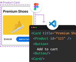
Please note that Builder pre-built templates, imports from web and imports from Figma, are all group locked by default. You can choose to unlock the group with a right click. You always have full flexibility and control with Builder!
Ease of use is crucial. Builder's visual editor 2.0 intelligently surfaces the most important options per element. If you are creating or editing columns, you'll see the number of columns on the top of your Options tab. If you are creating or editing an accordion or tabs, you'll see your slides or tabs on top of your Options tab.
Gone are the days when you had to scroll through your Layers and Options tabs to find and add a column or slide. Builder intelligently surfaces the most important options by element. And when you create a group, Builder aggregates all of the most important options for the grouped elements in one easy-to-scroll list.
And more...
Builder's visual editor 2.0 comes with a ton of additional usability enhancements, including the ability to zoom in and out of the content, an improved import from web experience, support for background images when importing from Figma, and much more.
We're focused on continuing to build the simplest, most intuitive and robust visual CMS for ecommerce with drag and drop page building capabilities, so stay tuned!


