Livestream: AI-Powered prototyping & wireframing | 4/24

Announcing Visual Copilot - Figma to production in half the time

Builder logo
builder.io
Contact SalesGo to App

Livestream: AI-Powered prototyping & wireframing | 4/24

Announcing Visual Copilot - Figma to production in half the time

Builder logo
builder.io

Blog

Home

Resources

Blog

Forum

Github

Login

Signup

×

Visual CMS

Drag-and-drop visual editor and headless CMS for any tech stack

Theme Studio for Shopify

Build and optimize your Shopify-hosted storefront, no coding required

Resources

Blog

Get StartedLogin

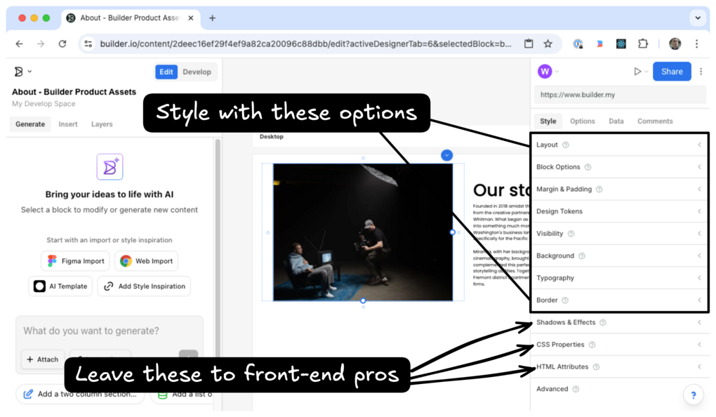
Use the style tab to define the layout of your page, modify typography, add spacing around images and blocks, and much more.

  • Select a block on the page to view it's style within the Style tab
  • Adjust spacing, size, and decorative properties for blocks
  • Add custom CSS classes or specific CSS rules as needed.

After selecting a block within the Visual Editor, select the Style tab.

Image of the Style Tab that advises the user to, "Style with these options: Layout, Visibility, Background, Typography, Margin & Padding, Border, and Shadows & effects.  Then, a second note states that the last three sections, Css Properties, HTML Attributes, and Advanced, are best left to front-end pros.

There are several panels within the Style tab, each of which can affect the chosen block:

  • Layout: Set the width and height of blocks, as well as its position on the page or relative to the containing block.
  • Block options: This option only appears for certain blocks, like images. Perform actions specific to that block, such as choosing the image for an image block.
  • Margin and padding: Adjust the spacing around a block.
  • Design tokens: Make use of your design tokens within your content entry. For more details, see Design tokens.
  • Visibility: Hide blocks on specific devices.
  • Background: Choose background colors and images.
  • Typography: Select fonts, text color, weight, and more to do with text.
  • Border: Set a block's border color and style.
  • Shadows and effects: Add text add box shadows to your block.

The final three panels are relevant only for those with additional front-end development knowledge.

  • CSS properties: Add specific CSS rules to your block.
  • HTML attributes: Define the specific HTML element to use for your block. Additionally, add attributes to the HTML that will be generated from the block such as id.
  • Advanced: In this panel, add specific CSS classes to your block or access the unique Builder ID that will be generated for this block.

Instead of designing your content entries from scratch, import designs directly from Figma to Builder and then tweak as necessary. For more details, see Builder Figma plugin.

Was this article helpful?

Product

Visual CMS

Theme Studio for Shopify

Sign up

Login

Featured Integrations

React

Angular

Next.js

Gatsby

Get In Touch

Chat With Us

Twitter

Linkedin

Careers

© 2020 Builder.io, Inc.

Security

Privacy Policy

Terms of Service

Get the latest from Builder.io

By submitting, you agree to our Privacy Policy

  • Platform Overview

    AI Overview

  • Integrations

  • What's New

  • Figma to Code Guide

  • Composable Commerce Guide

  • Headless CMS Guide

  • Headless Commerce Guide

  • Composable DXP Guide

  • Design to Code

  • Blog

  • Knowledge Base

  • Community Forum

  • Partners

  • Templates

  • Success Stories

  • Showcase

  • Resource Center

    Glossary

© 2025 Builder.io, Inc.

Security

Privacy Policy

SaaS Terms

Security & Compliance

Cookie Preferences

Gartner Cool Vendor 2024