The Builder Visual Editor is the core of Builder’s Visual CMS, where teams to create, edit, and publish content without needing to write code. This document introduces the UI, key features, and best practices for using the Visual Editor effectively.
- Drag and drop to build Pages and Sections without coding.
- Use custom components from your own codebase.
- Manage content with blocks and reusable Templates and Symbols.
- Use X-Ray mode and Layers to understand the structure of your layout.
- Monitor responsiveness with device previews.
- Track history and comments for collaboration.
- Test, target, and optimize content.
The video below covers these fundamental concepts. The rest of this document provides a written alternative of the same information.
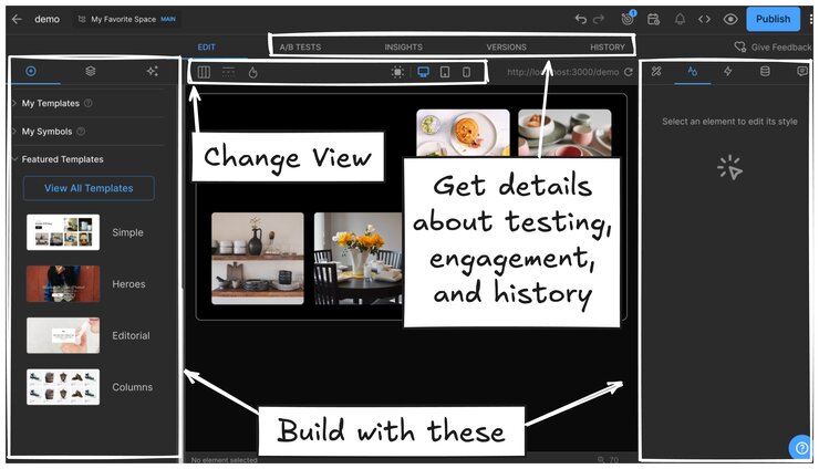
Builder’s Visual Editor loads your site inside a central iframe for real-time content editing on your live website. Around the main working area, there are many options available for building and optimizing your design.

For building, explore the tabs:
- Insert: drag and drop components
- Style: style content
- Layers: manage content layers
- Animate: adding animations
- Data: bind your Builder or third-party data
- AI: edit with AI
- Comments: comment and tag team members for collaboration
Optimize your content:
- conduct A/B tests
- insights on the current content engagement
- create and manage versions
- keep track of changes with history
Customize the Visual Editor display:
- choose 2- or 3-column layout to work your best
- toggle on X-Ray Mode for a closer understanding of element relationships
- show the heatmap
- choose the locale if you have them set up
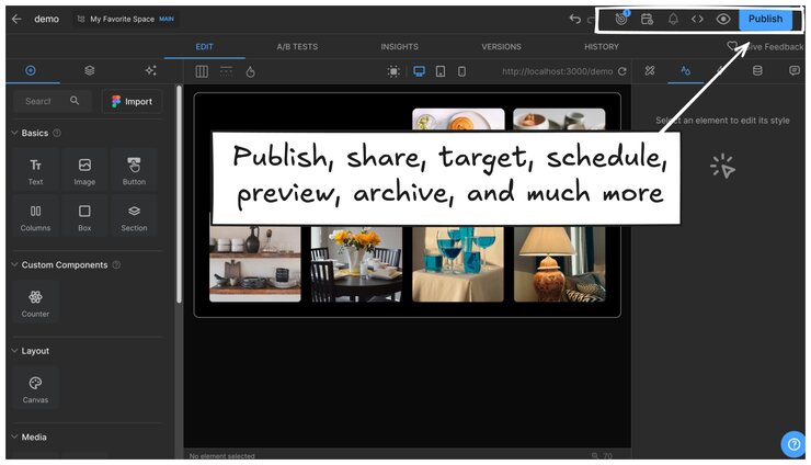
At the topmost right corner find content entry settings such as:
- targeting
- scheduling
- notifications, for example, when someone leaves a comment for you
- previewing
- publishing
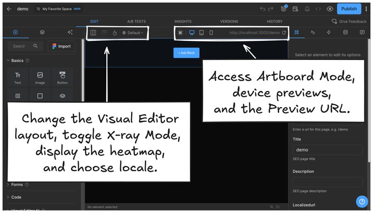
The top of the Visual Editor features a number of settings that change the display.

These options include:
UI Layout
- Three-column layout: moves Style, Animate, Data, and Comments tabs to the right panel.
- Two-column layout: displays all settings in the left panel.
X-Ray Mode
- Highlights hierarchical relationship of blocks.
- Helps locate empty blocks and nested blocks. For more, see
Heatmap
- The heatmap visualizes engagement data on Pages and Sections.
For more detail, visit Using the Heatmap section of Content Entry Insights.
Locale picker
- Previews content in different languages.
- This icon only appears if you have localization set up.
For more, see Intro to localization.
Responsive preview and Artboard Mode
- Switch between desktop, tablet, and mobile views.
- Adjust styling per breakpoint (applies styles at that level and below).
- In Artboard Mode, Intuitively edit, zoom, and preview your entire Page or Section while working, with tools like Mobile Preview and adaptive resizing to streamline your design process.
Preview URL
- Displays the URL currently loaded in the Visual Editor.
- Can be temporarily overridden for testing against different versions.
The Visual Editor uses blocks to structure content. Each block can contain text, images, buttons, or custom code components from your codebase. Blocks can be dragged and reordered for flexible Page layouts. Developers can even add their team's own blocks with Custom Components. Then designers, marketers, and editors can drag and drop their custom components just like the built-in components.
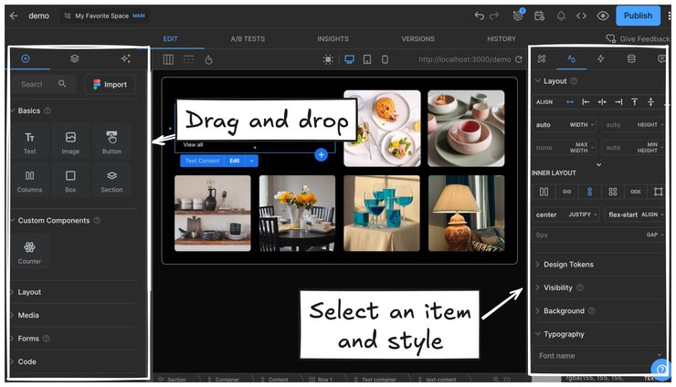
To start building, use the Insert tab to drag components, such as images, text, and other features onto the work area. Style the content you create by selecting a block and then editing the settings in the Style tab.
Inspect layers in the Layers tab, connect to your data in the Data tab, and leave comments in the Comments tab.
The image below shows the tabs in three-column view; two-column places all tabs together on the left of the screen, but the functionality is the same.

Insert tab
- Drag and drop built-in or custom components onto the page.
- Access
TemplatesandSymbolsfor reusable content.
Layers tab
- View the hierarchy of content elements.
- Rename layers for organization.
- Right-click layers for advanced options.
For more information, visit Layers.
Style tab
- Adjust
size,alignment,colors,typography, andspacing. - Apply custom CSS properties.
Animate tab
- Set
hover effectsandanimationsfor dynamic content. - See Adding Animations in the Visual Editor for more information.
Data tab
- Connect elements to third-party data sources.
- Set
event handlersand custom scripts.
For more, see Data Binding.
Comments tab
- Leave feedback on blocks or content entries.
- Tag teammates for review or with feedback. See Add comments to your content.
To get granular details on the current content entry, you can run and review tests, inspect user engagement, and delve deep into the entry's history.
A/B Tests
- Run content experiments to optimize user engagement. See A/B Testing for more.
Insights
- Track impressions, clicks, and conversions. See Content Entry Insights for more information.
History
- Inspect autosaved changes and previous states.
- Restore content.
- Create checkpoints for a snapshot in time. See History for more detail.
When you publish a content entry, it is pushed live; however, you handle hosting — Builder doesn't host. For more information, read You control hosting in Key Concepts.

Publish
- Click Publish at the far upper right corner to make content live.
- Unpublish, archive, copy to another Space, and much more.
Targeting and Scheduling
- Set start and end dates for content to go live automatically. See Schedule Content for more detail.
- Combine targeting and scheduling to get your content to the right people at the right time.
- Configure content targeting rules for localization and user segmentation. See Targeting Content for more information.
Notifications
- View mentions and updates on your content.
Preview and share
- Share preview links before publishing.
- Generate QR codes for mobile testing.
Speed up your workflow even more with Visual Editor keyboard shortcuts:
- Undo/Redo: mac
Cmd + Z/Cmd + Shift + Z, PCCtrl + Z/Ctrl + Shift + Z. - Move elements: arrow keys, Shift + arrow to move in increments of
10px. - Command Palette: for Mac
Cmd + kor for PCCtrl + kfor quick actions.
For a full list of shortcuts, visit Keyboard Shortcuts.
Your feedback helps Builder evolve to better meet user needs. For more information, visit Get help
Get familiar with managing your Settings in Builder, including billing, users, subscriptions, SSO, and localization For more detail, visit Settings.


