Connect to your Salesforce B2C Commerce API, bringing Product and Category info into Builder.
To get the most out of this document, make sure to have completed the following:
Setup Salesforce Commerce API Access: visit the Salesforce guide, Setup API Access, to make sure you already have your Shopper Login and API Access Service (SLAS) Public Client setup.
To enable the plugin:
- Go to Plugins.
- On the Salesforce B2C Commerce API tile, toggle the switch to the On position.
- The browser should refresh the page; however, you might have to do it manually. Once refreshed, the toggle is set to on and you should get a prompt to configure the plugin. Click Configure button.
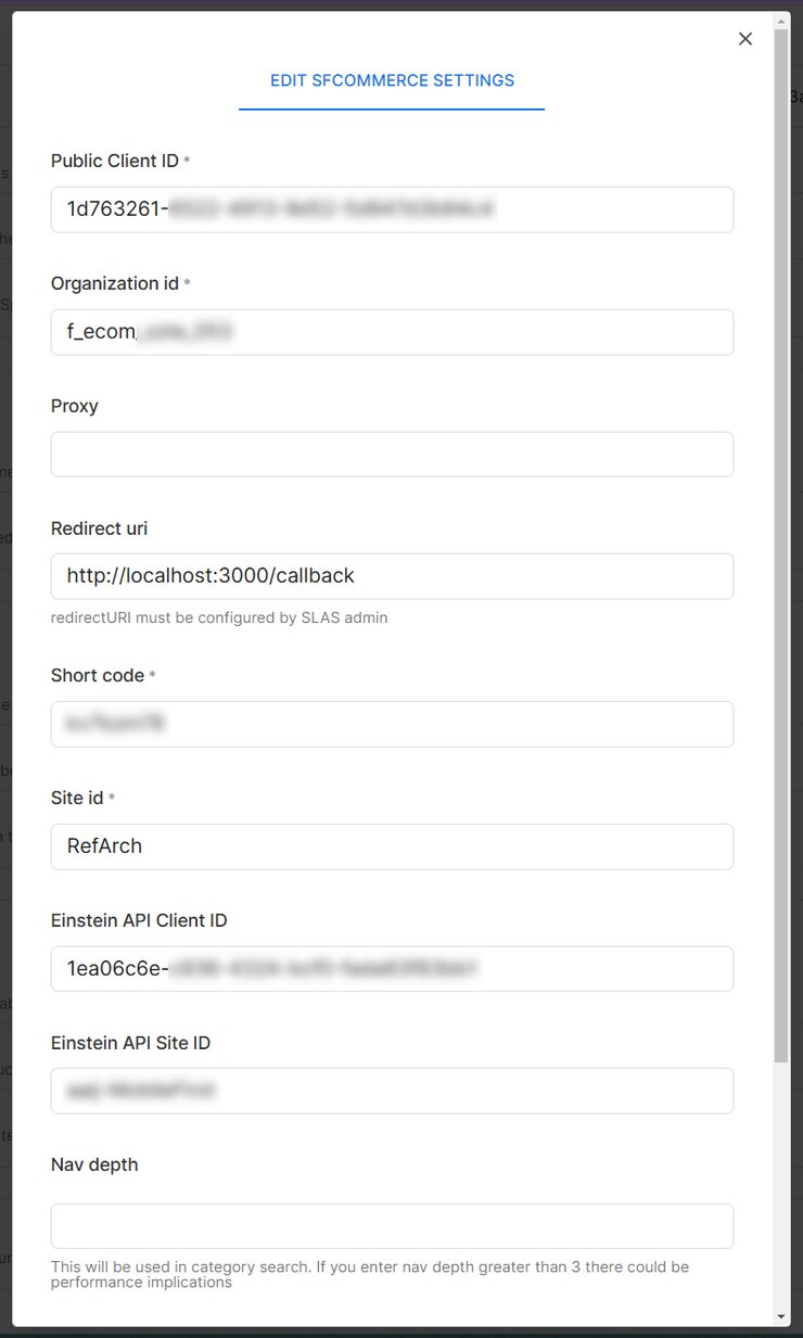
- In the modal that opens, you'll be prompted to enter the SLAS Public Client ID, Organization ID, Proxy (optional), Short Code, and Site ID. If you want to connect to Einstein as well, optionally provide the Einstein API Client ID and Einstein Site ID.
- Click the Connect your Salesforce Commerce API button to save your configuration.
The screenshot below shows the SFCC plugin modal:

Advanced configuration:
- By default, the plugin returns a category tree depth of
3. If you need additional L4/L5 categories, use the optional Nav Depth field. - Should your SFCC Category structure have a unique or multiple root categories, use the Root Category field to specify your Root Category ID. Uses
rootby default.

If you're using Salesforce's Composable Storefront kit, refer to the configuration in your config/default.js file.

With custom targeting in Builder, you can direct content according to a wide array of attributes. With the Salesforce Commerce API plugin, you can seamlessly integrate SFCC product or category details into your targeting criteria. Here’s how to configure it:
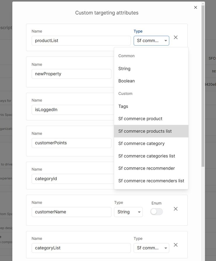
- Space Configuration. Custom targeting attributes are added to your Space's settings. Under Settings, Custom Targeting, click the Edit button then the + New Target Attribute button at the bottom, and choose the desired input type.
- This example uses
"SF commerce product". - Client-side rendering. To fetch content specifically for a product on its detail page, utilize the
builder.get()function withuserAttributesset to the product ID:
// example for fetching content specific for a product in a product details page
const productFooterContent = await builder.get('product-footer', {
  userAttributes: {
    product: product.productId,
  }
})- Server-side Rendering or API Requests. Pass the targeting attributes as a query parameter to your content API call or include them in your GraphQL query, as demonstrated in frameworks like Gatsby or Next.js.
For more details, visit the Content API documentation.
When you install the plugin, you can use specific SFCC data types as inputs for your custom components and models. These types enhance the interactivity and specificity of your components within the Visual Editor.
SFCommerceProduct: this input type allows the selection of an individual product, enabling the component to access and display product-specific information.SFCommerceCategory: select a specific category to tailor content or retrieve an array of products within that category directly in your component.SFCommerceProductsList: enables the selection of multiple products, ideal for creating product grids or list displays within your component.SFCommerceCategoriesList: allows multiple category selections, useful for broader content targeting and display.
Example: custom component configuration
Consider a custom component named ProductBox which integrates an SFCommerceProduct. Here’s how you might register it within Builder.io:
import React from 'react';
import { Builder } from '@builder.io/react';
import ProductBox from './ProductBox'; // Your custom component

Builder.registerComponent(ProductBox, {
  name: 'ProductBox',
  image: 'https://unpkg.com/css.gg@2.0.0/icons/svg/box.svg',
  inputs: [
    {
      name: 'productRef',
      friendlyName: 'Product',
      type: 'SFCommerceProduct',
      required: true
    }
  ]
});
For more details, visit Builder's SFCC Composable Storefront example on GitHub.
When fetching content from Builder, the includeRefs=true option fetches detailed data linked to specific references, such as an SFCommerceProduct, facilitating server-side rendering:
const page = await builder.get('page', {
  url: '...',
  options: {
    includeRefs: true
  }
});
Ensure this option is also enabled during the editing phase to automatically resolve data for your components:
<BuilderComponent model="page" options={{ includeRefs: true}} content={page} />For more information on the available options, visit the Content API documentation.
With the SFCC plugin installed, you can create custom models, components, and symbols using any of the SFCC field types and edit as needed.


