Search Engine Optimization (SEO) is a broad collection of strategic practices that might seem minor when each practice is considered on its own, but when all of these techniques are combined, they can help improve your site's UX and search engine ranking.
Optimize each page of your website by including keywords in the title, headings, and throughout the content. Use meta descriptions to summarize each Page's content and encourage clicks.
The default Page model in Builder comes pre-configured with a Title and Description field, two important fields that search engines use when indexing pages. The title and description are what appear in most search engine results lists, so always fill these out.
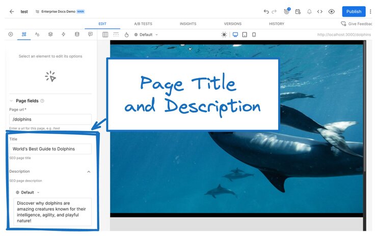
For instructions on setting Builder Page metadata, read Search Engine Optimization, and for even more info on customizing Page fields, read Custom Fields.
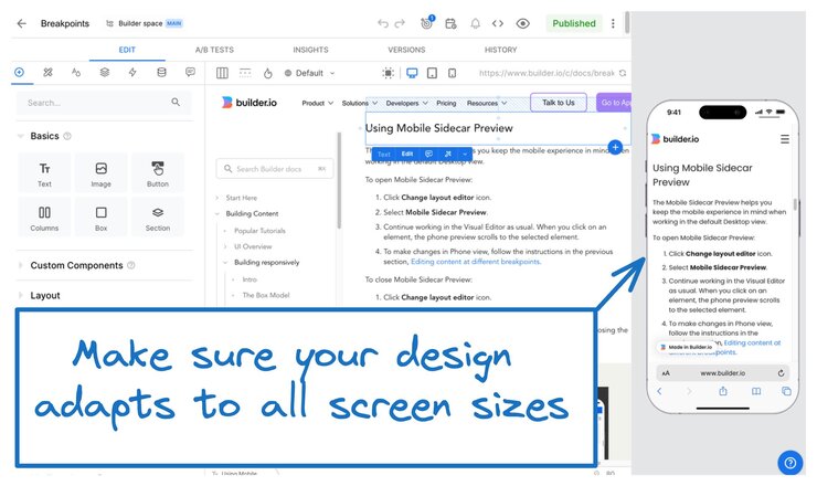
Ensure your website is responsive and maintains its design integrity on all screen sizes. Google, specifically, uses mobile-first indexing, which means that mobile-friendly sites get preference in search results.
Builder's built-in styles are by default mobile-friendly, but understanding responsive concepts can help you work smarter and faster.
For detail, read Builder's extensive Responsive Design documentation, a beginner-friendly tour of the principles of mobile-friendly design. Though it covers responsive design in the context of Builder, the concepts are universal to web development, whether you're using pure code or a drag-and-drop UI like Builder's Visual Editor.
When using images, leverage Builder to help search engines surface your content more effectively. Some tips include:
- A good URL structure includes naming and organizing your images. Use URL paths and file names that help image searches find your images.
- Create responsive content. Builder's default styles do a lot of the work for you when it comes to responsiveness, but understanding how responsive design and development work can help you work more efficiently as well as help you get your images higher up in the image search results list.
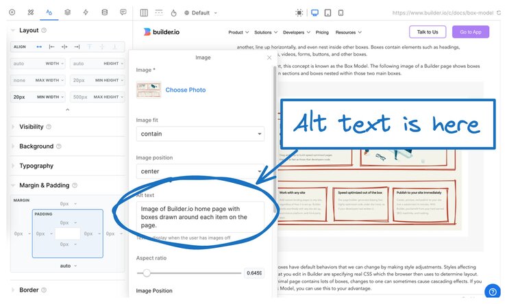
- If you have to put text in an image, be sure to include that text in the image's alt text as well as describe the concept in the page content. This helps make sure the content of images is available to more users and helps search engines understand your images.
- Make alt text descriptive, but don't stuff it with keywords.
The next image shows where to add alt text to images.
For more detail, visit Builder Best Practices and Working with Images.
Beautiful images and video can encourage visitors to stay on a site longer, but not if they require so much bandwidth that they are slow to load. When you use Builder's Image and Video blocks, Builder optimizes those assets to help keep your page size low. For more detail, visit Working with Images and Working with Videos.
When creating and managing your URLs, keep these points in mind:
- Keep site structure as simple as possible.
- Create clean, descriptive, and reader-friendly URLs for each page.
- Find and fix any broken relative links.
- Make sure your URL path structures are logical and straightforward.
- Prefer a minimal style for URL parameters.
- Block crawler access to URLs that don't need to be indexed, such as search results.
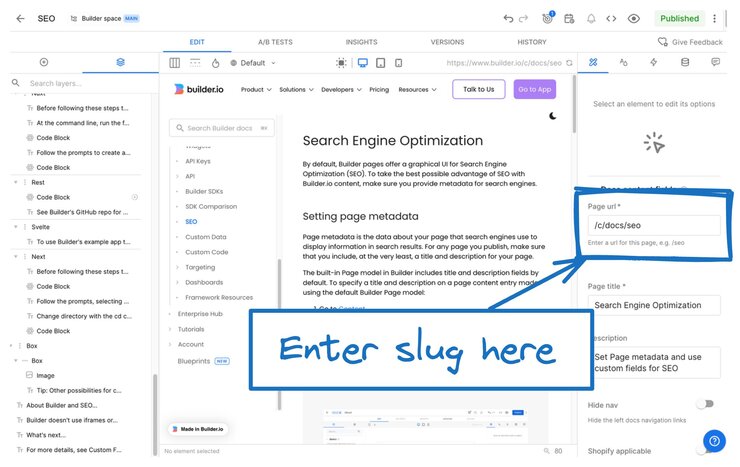
At a high level, after the domain in a URL, like builder.io, and any subdirectories, such as /docs/, the slug is next. The slug is the URL part that is unique to an individual page; for example, in https://builder.io/docs/seo, seo is the slug.
When creating your slugs, be succinct yet informative. Avoid long slugs with too many words and never keyword stuff, which search engines consider spam. As a result, this practice will lower your rankings in search results.
If a site's been around for a while, it's likely that the site structure has evolved and old URLs need to be updated. Rather than changing the slug of a given page, you can use redirects to funnel site traffic to the right places.
Once the code is set up for redirects, non-dev teammates can use the Builder UI to manage redirects without ever having to contact a developer.
For instructions, visit Setting Up Server-side Redirects.
To support UX and SEO, link your related pages to each other to help users navigate and search engines understand the structure of your site. Always use succinct but descriptive copy for links; for example, avoid links say "click here".
For internal links, Google recommends that if a page is important, you should link to it from at least one other page on your website. Try to avoid pages that lead nowhere and instead, always give your users more ways to explore.
For instructions on creating links in Builder, read Creating and Editing Links and for a programmatic approach to data for navigation, see the code-focused Integrate Navigation Links.
If you're on a Growth plan or higher, you can monitor your site metrics in the Visual Editor's Insights tab. Zero in on data such as behaviors, conversions, and where user's click with heatmaps.
Regularly monitor your analytics to understand visitor behavior and improve your strategy.
Intuitive navigation and hierarchy, along with great UX and clear calls-to-action keep visitors engaged and encourage them to stay longer, reducing bounce rates.
The following image is an example of one of the views available in the Insights tab. This example shows impressions and clicks.
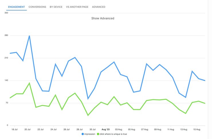
To get an idea of how to leverage Builder content metrics, visit Viewing Metrics with Insights.
For instructions on using Builder's UI for better SEO, visit Search Engine Optimization.


