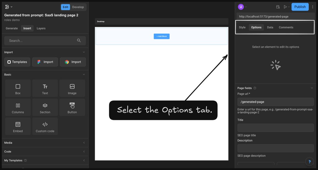
The Options tab in the Visual Editor provides options for configuring the content, layout, behavior, settings, and advanced properties of a block.
To display block-specific options, select a block and open the Options tab.

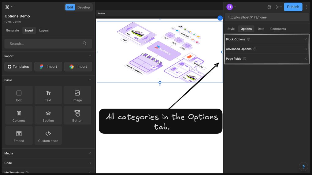
The Options tab provides the following sections, based on the selected Block types:
- Block options: configure common settings for the selected block.
- Advanced options: controls for layout, performance, and other advanced properties.
- Model fields: manage fields defined in the current model, such as metadata and targeting attributes. For details, see Model fields section.
The screenshot below displays all categories in the Options tab for the Image block of a Page model:

The table below lists configurable options by block type:
| Block type | Block Options | Advanced Options |
|---|---|---|
Section | Fit content: resize the container to match the contents. High priority: load early to improve largest contentful paint. Lock aspect ratio: preserve aspect ratio on upload. | Lazy load: delay rendering until the block is in view. |
Columns | Column layout: select a grid layout from the layout. Columns list: rename, reorder, or delete columns. Column: add a new column. | Space: define spacing between columns in pixels. Stack columns at: specify a breakpoint for stacking. Reverse columns when stacked: reorder columns on smaller screens. |
Image | Image: upload or select an asset. Image fit: define how the image fills its container. Image position: adjust the crop focal point. Alt text: describe the image for screen readers. Title: add tooltip text. Aspect ratio: lock to specific dimensions. Link URL: assign a hyperlink to the image. | Fit content: resize the container to match the image. High priority: load image early for performance. Lock aspect ratio: maintain current ratio during replacement. |
Video | Video: upload or select a video file. Poster image: set a placeholder before playback. Auto play, controls, muted, loop, and plays inline: toggle standard playback features. Fit, preload, position: adjust layout and loading behavior. Aspect ratio: lock dimensions. Link URL: assign a hyperlink to the video. | Fit content: resize container to match the video. Height and Width: define dimensions manually. Lazy load: defer video loading until in view. |
Custom code | Code: insert custom HTML, CSS, or JavaScript. Link URL: assign a destination link to the code block. | Replace nodes: preserve server-rendered DOM. Scripts client only: run scripts only on the browser. |
Box | Link URL: set a destination link for the block. | |
Text | Inline text editing: enable text editing with a double-click. Link URL: assign a hyperlink to the text. | |
Embed | URL: enter a valid embed link, such as YouTube or Google Maps. |
This video demonstrates how the Options tab displays different options as outlined in the Options by block type table, for each block type, categorized into Block Options and Advanced Options:
Use model fields to configure SEO metadata, targeting attributes, and any custom fields defined in the content model.
The Model fields section appears in the Options tab and includes fields from the Builder Model used to create the current content entry. The section title reflects the model name.
For example:
- If the model is a default Page model, the section is Page fields.
- If the model name is Product, the section is Product fields.
Note: This section does not apply to Fusion Space.
- For more information on using the Blocks, see Insert tab.
- To learn how to style the blocks, see Style tab.
- To bring interactivity within the content entry, see Data tab.
- To define custom fields for content models, see Custom fields.


