Practice the use of Builder Blocks by building a responsive footer directly within the Visual Editor.
- Use Columns, Image, and Text Blocks to create complex designs within the Visual Editor.
- Check the responsiveness of your designs within the Visual Editor.
This tutorial results in a basic callout with text colors, fonts, spacing, and sizes aligned with a project's codebase.

To complete this tutorial, you need:
- An integrated Page or Section and access to your codebase.
Begin by adding a Section and Columns block to the content entry.
- Add a Section block to your content entry.
- Add a Columns block within the Section block.
- Select the Columns block, and then the Options tab. Choose the option for three columns.
You may want to adjust the styles of either the Section or Columns block. In the video below, after adding the Section and Columns block to the content entry, the background of the Section block is updated to a light grey color.
You may now begin adding blocks to the footer.
- Add an Image block and a Text block to the first column.
- Upload or select a logo for the Image block. Adjust the size and position of the image.
- Update the Text block with a description.
- Add a Box block to the same column. Place both the Image and Text blocks within the Box block to contain both elements.
- Adjust the horizontal and vertical alignment of the Box block as needed.
Adjust the styles of each block element as needed to improve your design. You may need to change the margins, padding, or size of multiple elements.
Add headings and links using Text blocks.
- Add Text blocks to the content entry for each heading and link within the footer.
- Add spacing, colors, and styling as needed to match your brand.
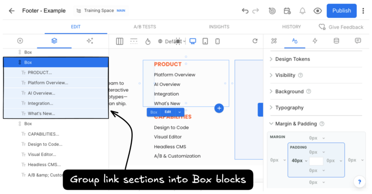
- Wrap each link section in a Box block. This will make it easier to duplicate and style.
For more details on how to format text, visit Style tab.

Add URLs to your link text to make them active.
- Select a link's Text block.
- Go to the Block Options tab.
- Within the text editor, select the text and click the link icon. Paste your URL.
Builder's Visual Editor will keep the text style you defined for each Text block rather than add default link styling.
Check the responsiveness of your design by clicking the tablet and mobile icons at the top of the Visual Editor. In the Modern UI, you can scroll to the Mobile artboard view instead.
Take a tour of the Visual Editor with Intro to the Visual Editor, learn more about the Columns block with Adjust columns, or learn more details about Links.
Use a Symbol to build repeatable, reusable blocks with a single truth source. A footer could be a good use case for a Symbol.


