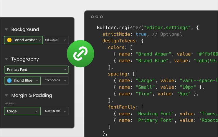
By providing your own design tokens, you can define a consistent set of design values that are available to your users in the Builder Visual Editor.
In this way you can:
- Maintain brand consistency. By providing predefined design tokens, you ensure that your app's design stays consistent and adheres to your brand guidelines.
- Streamline content creation. Users can quickly select from a curated set of design options, rather than having to manually input values or make design decisions.
- Centralize design updates. When you update your design tokens in code via CSS variables, those changes are reflected across your app, making it easy to manage and evolve your design system.
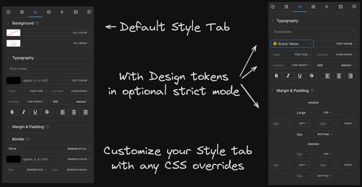
The image below compares the default Style tab in the Visual Editor (on the left) with a customized Style tab using design tokens (right).
You have flexibility in how you configure and use design tokens:
- Customizable values. You can define design tokens for various CSS properties, such as colors, spacing, typography, and other CSS properties. Choose which properties are most important to standardize for your app.
- Integration with CSS variables. Use CSS variables to define your token values, allowing for efficient updates and theming across your application.
- Granular control. Decide which CSS properties users can edit and whether they can input custom values or only select from your predefined tokens.
This document explores how to register design tokens in your code and the various options available for fine-tuning behavior in the Visual Editor.
To register design tokens with Builder, use the register() function from the Builder SDK and provide your designTokens definition in the editor.settings object.
Here's an example of specifying design tokens in code for use in the Builder Visual Editor:

For maintainability, we recommend using CSS variables as token values whenever possible.
The image below shows how the above example code renders in the Visual Editor. Notice that the colors, spacing, and font family specified in the code are now available in the Style tab.
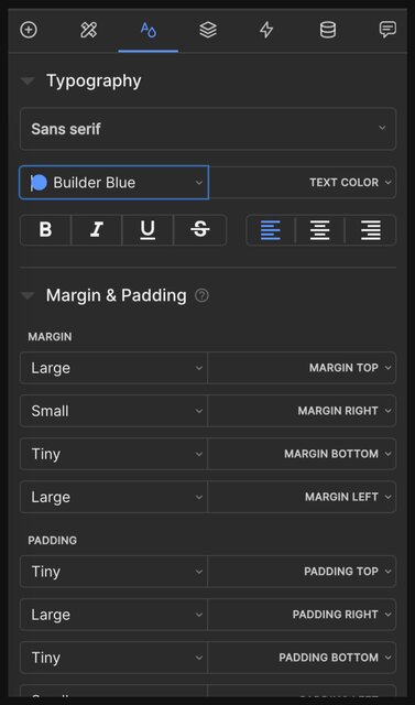
The most commonly used properties you can assign tokens to are colors, and spacing but you can also define tokens for any other CSS properties such as backgroundImage, borderRadius, and boxShadow, to name a few.
Design tokens are defined as an array of objects, where each object has two properties:
name: the display name in the Visual Editorvalue: the CSS value, such as a CSS variable (recommended)

Changes to design token values are not retroactive unless you use CSS variables
value property in your code to a new value, existing usages of the token will keep the old value.To set values that can be updated retroactively, read the CSS variables for dynamic design tokens section later in this document.
Affects all color-related properties in the Visual Editor, such as font color, background color, and border color.
Example:
Color properties
name: the display name of the color token in the Visual Editor.value: the CSS color value, which can be a hex code, RGB, RGBA, or a CSS variable.
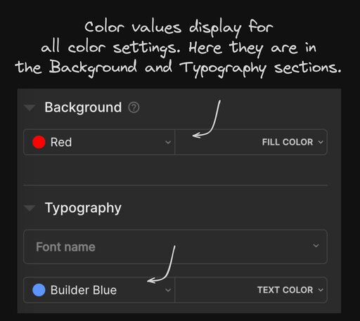
Affects all spacing-related properties in the Visual Editor, such as margin, padding, and sizing.
Example:
Spacing properties
name: the display name of the spacing token in the Visual Editor.value: the CSS spacing value, which can be in pixels, ems, rems, or percentages.
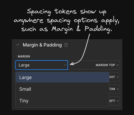
When defining design tokens, considering how you want to update and maintain those tokens in the future is key. By using CSS variables to define your design tokens, you can update the token values in your code and have those changes automatically reflect across all content using those tokens.
When you select a token in the Visual Editor, the value comes from the CSS variable defined in your CSS. Fallback values in the designTokens configuration are used only when the CSS variable is undefined. These are not the primary source of truth.
Using CSS variables as the source of truth means:
- Centralized updates: A single change in your CSS file updates all instances of the variable across your app.
- Consistency: Ensures the fallback value is only used as a safety net for edge cases.
- Maintainability: Reduces the need to update individual design tokens in the Builder configuration.
When working with CSS variables and design tokens, use these guiding principles:
- Define CSS variables in a global CSS file. Use a file like
global.cssto define your variables. - Reference defined CSS variables in your design tokens. In your design tokens configuration, use the
var()function to reference these CSS variables. Provide a fallback value only for edge cases where the variable might not be defined. - Update CSS variables directly in CSS. When you want to change the value of a token, update it in your CSS file — such as
global.css. This way the change propagates everywhere you use the variable.
To use CSS variables for your design tokens, first define the variables in your CSS code. For example, in your global.css:
:root {
  --primary-color: rgb(12, 34, 56);
  --spacing-large: 20px;
}
Best practice: always set default values
When using CSS variables, always set a default value as the second argument in (var(--name, default-value)), so Builder's Visual Editor can pick up a value, such as the color preview swatch.
Next, reference your defined variables in designTokens and then, when needed, update the variable directly in your CSS as in the next sections.
To use CSS variables in the designTokens object, reference the CSS variables using the var() function.
In this example, the Primary color token is defined using the --primary-color CSS variable, and the Large spacing token is defined using the --spacing-large CSS variable.
To update the values of your design tokens, that are using CSS variables, update the corresponding CSS variables in your code. For example, if you want to change the primary color from red to pink, update the --primary-color variable in your CSS:
:root {
  --primary-color: pink;
  /* ... */
}
By updating the CSS variable value, all content using the Primary color token automatically update to pink without requiring any manual changes in Builder.
Using CSS variables for your design tokens provides flexibility and maintainability, so you can update and theme your design system across your application.
- Always define CSS variables in your CSS files, not just as fallback values in the
designTokensconfiguration. - Use fallback values only as a backup, not as the primary source of truth.
- To change a token’s value, update the corresponding CSS variable in your CSS file.
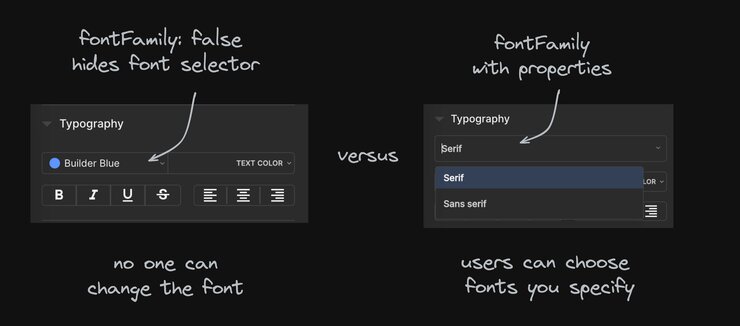
To prevent a CSS property from displaying in the Visual Editor, supply false for that CSS property. The code snippet below hides the font family select:
designTokens: {
  fontFamily: false
}
The above setting would cause Builder to hide the font family select. In the left screenshot below, the font family select is hidden because fontFamily is set to false. On the right, fontFamily has properties configured in the designTokens object so they display in the Visual Editor.
You can override any CSS property by specifying that CSS property in camel case. This section covers a number of examples, but this technique is applicable to a wide range of CSS properties.
You can use this same technique with any of the CSS options in the Style tab.
Examples include:
borderboxShadowfontSizefontFamily
letterSpacingmaxWidthfontWeighttextShadow
When configuring any CSS properties, provide a name and value, just as with any design token. Some examples follow.
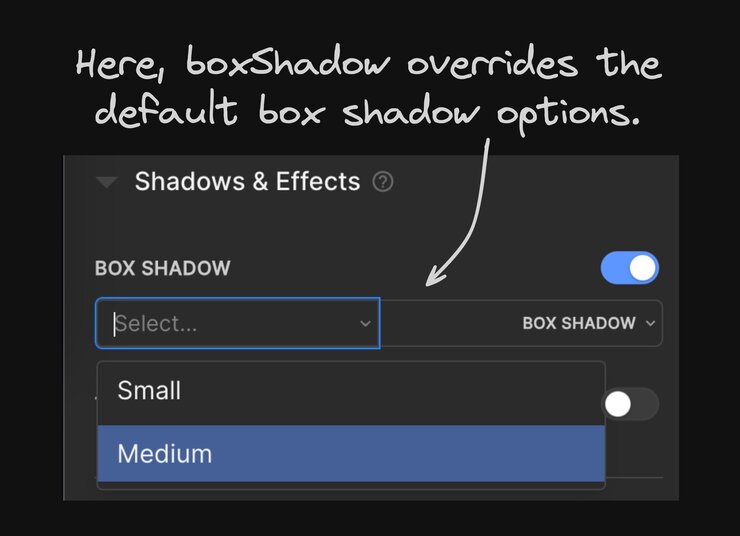
Affects the box shadow selection in the Visual Editor's style settings.
Example:
Properties
name: the display name of the border token in the editor.value: the CSS border value, which can include the border width, style, and color. It can also use CSS variables.
In this example, one border token is defined:
Success with a value of 1px solid var(--green), representing a 1px solid border with a color defined by the CSS variable --green.
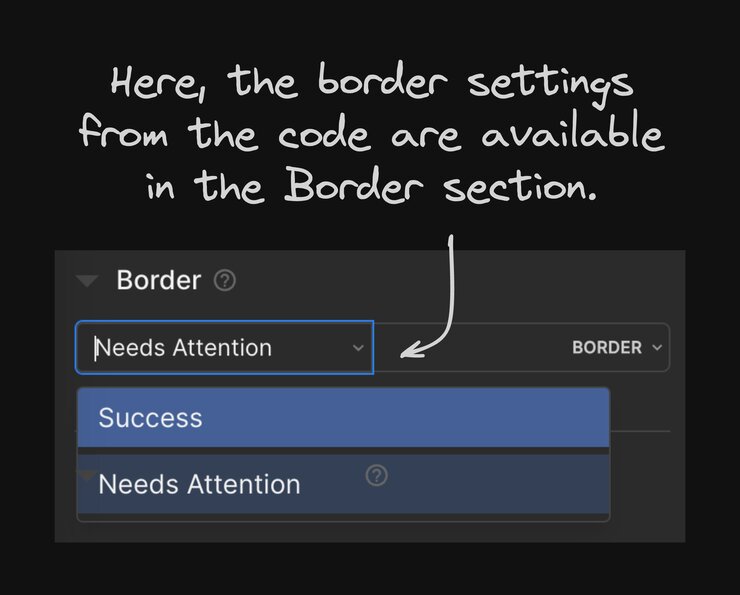
Affects the box shadow selection in the Visual Editor's style settings.
Example:
Properties
name: The display name of the box shadow token in the editor.value: The CSS box shadow value, which can include the horizontal offset, vertical offset, blur radius, spread radius, and color. It can also use CSS variables.
In this example, two box shadow tokens are defined:
Small with a value of 0 0 5px rgba(0, 0, 0, 0.1), representing a small shadow with a 5px blur radius and a semi-transparent black color.
Medium with a value of 0 0 var(--shadow-medium) var(--black-medium), using CSS variables for the blur radius and color.
You can register different design tokens based on a number of different attributes, such as the currently editing model, space, user role name, or permissions.
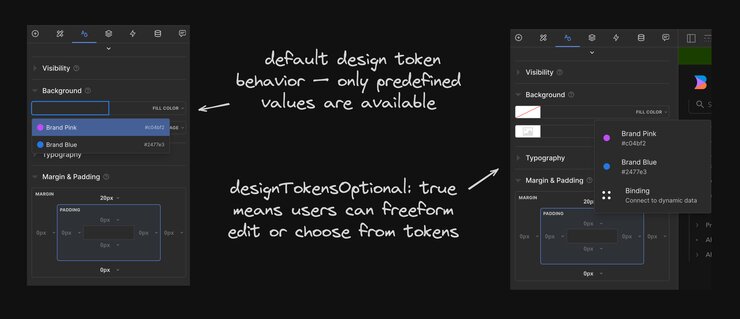
By default, when you define design tokens for a specific CSS property, the Visual Editor limits users to selecting only from the predefined token values for that property. However, you may want to give users the flexibility to enter custom values in addition to the predefined tokens.
allowOverridingTokens is a boolean that you can use to specify that users can override registered design tokens. This encourages use of the registered values, while still providing the option for users to specify other values.
In the video below, users can add values to a CSS property because allowOverridingTokens is set to true. In this example, the user expands the font select to find only the registered design tokens of a serif font and a sans serif. However, with allowOverridingTokens to true, the user can type in their font.
To enable this behavior, set the allowOverridingTokens option to true when registering design tokens:
When allowOverridingTokens is set to true, users can select from the predefined design tokens or enter custom values for the corresponding CSS properties just as they would when there are no design tokens provided in the codebase. However, in order to override the values, users need to manually enter their desired value.
This provides a balance between maintaining consistency through predefined tokens and providing flexibility for custom values when needed.
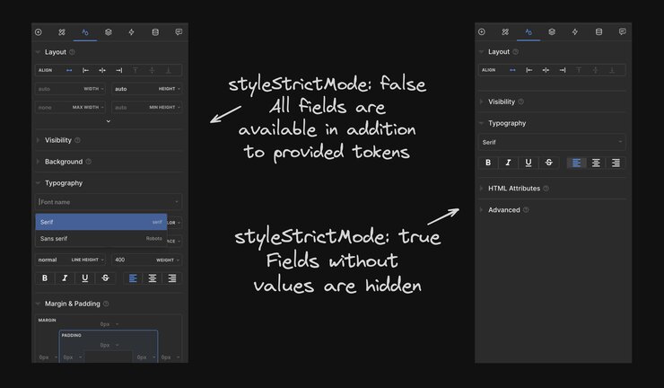
When strict mode is off or false, which is the default, and you supply design tokens for a specific CSS property, the Visual Editor only allows selecting from the predefined tokens for that property. Custom values cannot be entered for properties that have design tokens defined.
Strict mode takes this a step further. When strict mode is on, any styles that don't have corresponding design tokens are removed from the Visual Editor and users won't be able to edit those styles at all.
The snippet below shows styleStrictMode set to true in the the register() function:
If strict mode is set to true and no design tokens are supplied, almost all styling options are removed. Users will only be able to adjust basic settings like text alignment and layout alignment.
When strict mode is on, and you have design tokens supplied for specific CSS properties, users can edit those properties but are limited to the predefined token values. All other properties without design tokens are hidden and not editable.
With designTokensOptional, you can provide your design tokens while keeping the built-in Builder options available to your users.
For example, when registering your editor settings, add designTokensOptional set to true:
As an example, the image below shows brand colors that are specified in the designTokens object. Because designTokensOptional is set to true, they show up in the Builder Visual Editor anywhere there's a color selection available. Here, they display in the list of colors while the color picker remains available:
