

The Rise of Visual Editing in Headless CMSs
Last updated: February 5, 2025
What if there were a way to make both content editors and marketers happy without engineering help or expertise in APIs for every small content update? This is where visual editing comes into play by providing more autonomy for teams working with content and data in a headless architecture.
In this guide, you’ll learn the following:
- Types of visual editing
- Difference between preview and live preview
- What is visual editing
- Visual editing throughout the years
- Builder's visual editing with AI
Let’s dive further into visual editing and how utilizing a headless CMS with a visual editor can speed up your time to market.

4 types of visual editing workflows
Understanding the spectrum of headless CMS visual editing capabilities can help you better evaluate the pros and cons of each CMS so you can feel confident creating a rubric to evaluate the best CMS for your team.
To help explain the spectrum of visual editing workflows that headless CMSs offer, we’ve broken them into four types. These types of visual editing workflows are not mutually exclusive — each has a specific use case with pros and cons, and in most cases, a CMS will offer multiple. For example, Builder.io offers all four.
| Types of Visual Editing | Advantages and Limitations |
|---|---|
Visual edit buttons | This approach offers a simple way to try out basic visual editing on a headless CMS. Though limited in capabilities, the buttons provide an easy entry point for experimenting with visually manipulating content from the live site. The main benefit is locating editable elements swiftly for convenient discovery and tweaking. Consider using edit buttons as a lightweight first step before advanced visual editing integrations. Advantages
Limitations
|
Visual live preview | This approach still requires manually structuring data and wiring renders like a traditional headless CMS. Beneficial when a defined schema is needed, but inflexible for editors to freely rearrange or modify content without engineering support. Provides visual feedback but within the constraints of existing structures. The tradeoff is structure versus edit flexibility. Advantages
Limitations
|
Visual component composition | This approach inverts the traditional headless CMS by having developers build reusable components with defined inputs rather than hard code layouts tied to tabular data. These modular components can then be freely assembled to create new layouts across the site without engineering tickets for every change. This enables true drag-and-drop building and editing of content, rather than just previewing within constrained structures. The flexibility comes from composing shareable components instead of defining fixed schemas. It removes friction for content changes, but requires upfront investment in a component library before leveraging its agility. Advantages
Limitations
|
Visual no-code editing | This approach enables on-the-fly visual layout building without needing developers to first create reusable components. This allows content teams flexibility to independently make additions instead of depending on engineering. Benefits are agility and freedom, but risks include inconsistencies without governance from shared parts. There are always tradeoffs between flexibility and governance with no-code. Advantages
Limitations
|
📖
Read more on the four approaches to visual editing.
What is the difference between preview and live preview?
The primary difference between preview and live preview in headless CMS platforms boils down to how quickly UI renders the content in the browser. In many cases, teams will use both previews and live previews.
A preview is a near-production-ready deployment of a digital experience that can often be shared as a live staging link to the experience outside of the CMS. For example, frontend cloud platforms such as Netlify and Vercel give content editors a way to trigger preview deployments to staging infrastructure from their headless CMS so they can review the entirety of a site.
This standard preview approach is good for getting a view of exactly what the experience will be once published or when the changes you make can affect many visual or non-visual experiences across a site or app. However, in some cases, it takes a significant amount of time to generate. For example, a large site with thousands of pages could take ten minutes or more to generate before the UI renders the content to the browser. If they need to make a change, it’s another ten minutes.
A live preview in visual editing usually refers to a window in a headless CMS where content editors can see how the changes they make to content will look to the end user in real time without needing to publish changes to a staging environment. It helps content editors make iterations much faster than a standard preview because they don’t have to wait for an entire experience to “build” or publish to determine, for example, that the copy they’ve entered is overflowing on a webpage or the image they’ve added doesn’t fit well.
Live preview functionality may be enabled through CMS plugins, built-in platform capabilities, or integration with third-party preview tools. The implementation options vary across different headless CMS products.
What is visual editing?
Visual editing within a headless CMS refers to the ability to visually render content into the browser for the end users.
It may sound basic that a content editor can quickly see what a new block of text or image will look like on a page or screen, but for years, most headless CMSs required content editors to enter content into restrictive form interfaces. If they wanted to preview, for example, how the text they entered into the "header" field would render, they sometimes had to wait minutes to generate a static preview in a staging environment.
Today, most headless CMS providers strive to provide visual editing capabilities, but the type of visual editing they offer varies greatly, and the kind you end up with can significantly affect your team's velocity.
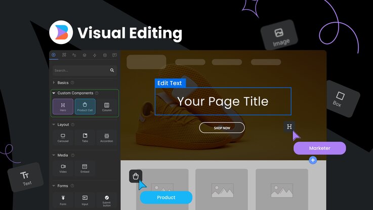
Builder.io's visual editing gives teams the entire spectrum of visual editing capabilities: visual edit buttons, visual live preview, visual component composition, and visual no-code editing so anyone can quickly create, update, and optimize content and experiences without needing a developer's help.
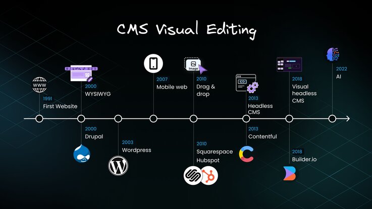
CMS visual editing through the years
Visual editing capabilities have evolved significantly to support emerging technologies and needs over the past decades.

Open source CMS WordPress and Drupal introduced WYSIWYG editors and template customization to empower independent publishing but page building was still largely code-driven.
Around 2010, SaaS CMSs like HubSpot and SquareSpace launched with drag-and-drop page builders so marketers could freely rearrange page elements without developer help. However, these platforms made it time-consuming for developers to iterate code when they needed to integrate new services, add custom analytics, or add custom functionality because they had to develop within the guardrails of the platform and couldn’t use modern tooling, frameworks, and development best practices (such as staging, development, and production environments).
API-first headless CMS platforms were developed to work with newer frontend frameworks and mobile development, as well as provide a more efficient way to distribute content to multiple channels via API. Essentially, the headless CMS acts as a thin layer on top of a database, decoupling the frontend from the backend.
However, this content management solution has a major drawback — no matter how many schemas and fields exist in the CMS, business teams still require additional ways to grow the business. This includes features like multiple CTAs, carousels, multi-column layouts, text formatting options, multiple images, and more.
With a headless CMS, teams get stuck in an endless cycle of needing to add more schemas and fields, then hard-coding everything into the website or application. While it's an improvement over no CMS or a legacy monolithic one, the headless CMS does not provide a complete solution for modern tech stacks and large digital businesses' needs.
The evolution towards a visual headless CMS through visual editing aims to find the right balance between empowering autonomy for content creators and maintaining modular content architectures across customer touchpoints.

Benefits of visual editing
Here are some of the key benefits of the visual editing capabilities provided in Builder.io:
- Faster iterations — Break free from workflow bottlenecks that slow down development, hinder growth, and hurt team morale. Adopt a truly collaborative development approach to find your perfect balance of developer control and business team autonomy, and build faster together.
- Fewer design issues in production — Enables digital marketers to easily construct high-performing, on-brand web pages optimized for SEO by dragging and dropping components, iterating quickly, and localizing content with minimal effort. Frees developers to concentrate on coding rather than content creation.
- More efficient collaboration — Builder.io allows granular control over user roles and permissions so teams can customize access and capabilities to fit their workflows. It facilitates real-time collaboration for conflict-free simultaneous editing. The platform also provides detailed edit histories, commenting tools for feedback conversations, configurable workflows like approvals, and easy content sharing across spaces.
- Intuitive drag-and-drop Interface — Builder.io's Visual Editor gives you a way to visually drag and drop sections, columns, and components to build templates and pages without coding. This enables much faster page building.
- Empowered experimentation — The visual editor, coupled with instant previews, lets teams quickly try out variations of layouts, styles, and test hypotheses. This allows rapid iterating without developer validation.
- Seamless cross-platform delivery — Components and content models created once can flexibly assemble experiences across platforms such as web and mobile, while limiting duplicated efforts.
- Consistent design systems — Building sections visually ensures brand guidelines, style rules, and themes are automatically applied consistently. This promotes on-brand customer experiences.
- Unified collaboration — The shared visual language around models, templates, and components enables better collaboration between marketers, content authors, and developers.
- Higher velocity — By focusing visual editing on reusable content building blocks, Builder.io lets you scale experiences faster across channels and locations without major lift.
Familiarise yourself with the Visual Editor.
While visual editing has clear user experience advantages, many legacy CMS platforms have lagged in adopting these capabilities more universally due to the substantial added complexity for engineering, lack of modular frontends, perception of reduced customization flexibility and the significant ongoing investment required.
Additionally, some open-source CMS platforms prioritize developer experience over intuitive content editing for creators, while others are tied to monolithic architectures without separation of content and presentation. With content becoming increasingly imperative, a CMS provider's readiness to undertake the necessary transformation is now determining the pace of visual editing innovation across the landscape.
Builder.io centers visual editing around empowering users while retaining modular content capabilities — the best of both simplicity and flexibility. This drives greater velocity and experimentation in headless experiences.
How does AI impact visual editing?
Builder's Visual Editor includes an AI-powered feature that goes beyond basic WYSIWYG functionality. This AI can parse your component library and construct pages programmatically.
Here's the workflow: You input a natural language description of your desired page, and the AI algorithmically assembles it using components from your existing codebase. It's like having a developer who knows your entire design system.
The AI's capabilities extend further. For novel requirements, it can generate new components on the fly, handling everything from JSX structure to styling and content.
The process is intriguing from a technical standpoint. You're essentially providing a high-level spec in natural language, which the AI then compiles into a functional page. It significantly reduces boilerplate coding and can serve as a rapid prototyping tool.
📖
Read about how Visual Copilot uses AI to add interactivity.
Builder.io Visual Development Platform
At Builder.io, we offer a powerful combination of user-friendly visual tools, collaboration-friendly features, and efficient publishing capabilities. We have a Google Chrome extension to quickly help you edit content within the web browser and Visual Copilot that converts Figma designs into clean code. You can incrementally adopt Builder’s Visual CMS or rebuild your frontend from scratch using any tech stack.


