Use margin and padding to space blocks from each other and change the space between a block's content and border.
An example of margins is the space between tiles on a page. If you don't want the tiles all touching each other, you'd add margins to put some space between them.
An example of padding is making a button wider and taller so that it is easier touch with a fingertip or broad pointer.
Think of padding like the stuffing you put in a pillow to make it bigger. Think of margins as the space between the pillows.
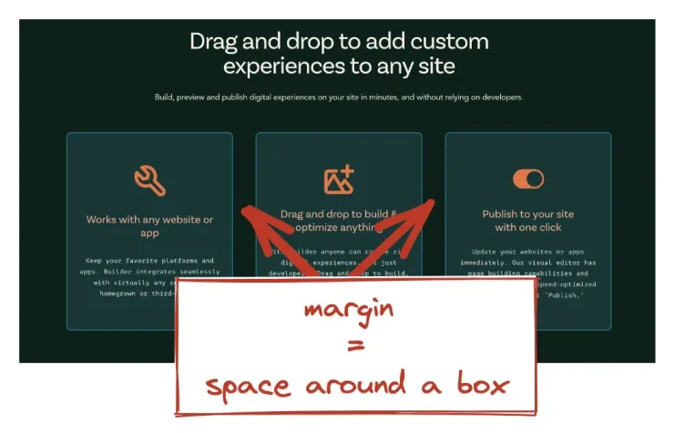
A margin is the space around the outside of a box. The following image features three boxes in a row on a webpage. The space between the boxes is margin.

To adjust margins, take the following steps:
- Select the block that needs margin adjustments.
- Go to the Margin & Padding section of the Style tab.
- Adjust the values in the outer rectangle to set the margin.
You can use any legal CSS unit for the value, such as percentage, ems, rems, or pixels (px).
The following video demonstrates adjusting the margin settings on a Text block. As the margin values change, the Text block moves further from or closer to the blocks above and below as well as either side.
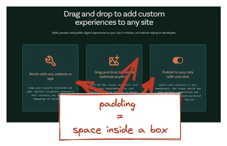
Padding is the space inside of a box, specifically the space between the content, such as copy, and the border of the box.
The following image features three boxes in a row on a webpage. The space within each box, between the content and the border is padding.

To adjust padding:
- Select the block that needs padding adjustments.
- Go to the Margin & Padding section of the Style tab.
- Adjust the values in the inner rectangle to set the padding.
You can use any legal CSS unit for the value, such as percentage, ems, rems, or pixels (px).
The following video demonstrates adjusting the padding settings on a Text block. As the padding values change, the Text block grows or shrinks while its margins–the distance from the top and bottom boxes, as well as either side–remains unchanged.
Margin and padding are best for adding space around and inside of a block. Though sometimes adjusting these settings can make it appear as though the block position is changing, the margin and padding still take up space and affect the flow as the page attempts to adjust to different screen sizes.
Instead, use Alignment settings in the Style tab to significantly adjust the location of an item within its containing block. Reserve margin and padding for basic styling rather than overall layout. By sticking to these guidelines, and leveraging Builder's built-in responsive styles, you'll be able to concentrate more on connecting with your users.
Understanding margin and padding are integral to great layout. For more information on using Builder to create responsive layouts, read Using Columns for Responsiveness, which covers how Builder's built-in Columns block adapts to different screen sizes automatically.


