shopify app
Theme Studio includes powerful tools to help you build a great e-commerce website. One of those tools is A/B testing, an effective technique to optimize your site and drive more conversions. A/B testing is the process of showing different variations of a page to different visitors of your website, and then using data on what those customers did to determine what content drives more sales.
In this guide, we'll show you how to create and run an A/B test on your homepage. So if you are wondering: "How do I create a new homepage in builder and then test that against my current homepage?," you are in the right place! Although the example we are using utilizes a section on the homepage, these techniques can be applied to any of the other page types in your store. Let's dive in.
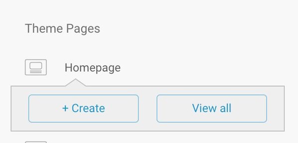
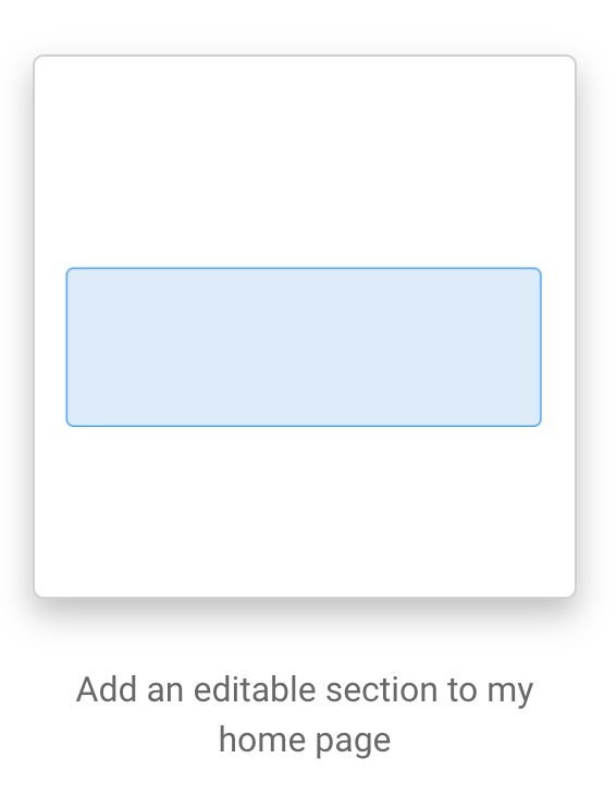
Starting in theme studio, click on Homepage and select +Create. Select Add an editable section to my homepage to to create a new version of the homepage.


Next we'll select the area in which we want to add our editable section. In this example, I'm going to choose to add the section to the top of my homepage.
From here, it'll take us directly into the Builder Visual Editor where we can start adding our test.
At this point we can decide to keep our current homepage exactly the same and test it against a new variation we build in Builder, or add something to our page (like an image) and test some variations of that content. The steps required to A/B test in either of these scenarios are essentially the same. If wanted to keep our homepage the same and test a completely new version against it, we can skip adding any content and go straight to creating the A/B test.
For the sake of this tutorial, let's pretend we just started selling a new product and we want to find out what sort of imagery works best to get people interested in buying it. In order to figure this out, we are going to build a section at the top of the homepage to announce the product. We have a hypothesis that the right image will consistently drive more conversions, but we do not know what image is best just yet. Luckily, with Builder's built in A/B testing, we can find out.
Start by adding an image at the top of the page, followed by an announcement that sits on top of the image. To do this, drag an image component over into the dropzone in the editor, and select or upload an image. Next, drag over a text block on top of the image. We can easily make some style tweaks as we go along using the Style tab in the menu to the left. Finally, let's also add a button that people can click to lead them to the product page.
The next step is to create an A/B test variation. To do that, click on the A/B Tests tab right above the preview in the Builder editor. Once in that tab, click on "Add A/B test variation." Once you click on that, the new content is created and we can start making changes! Notice that in that tab we are also able to choose the percentage of new visitors that see a particular variation using the sliders.
Now let's go back and edit our variation to include the alternate image. Click on the Edit tab to go back to the editor and then click edit on the image block to upload a new image. If you also wanted to modify the text, or button, or anything else on the page that you think will help drive conversions, you could do that now too.
Once we have made all the changes we want, we can toggle between the different versions of our page by clicking the dropdown located by "Targeting" at the very top of the editor. This is a quick way to flip between the variations we have to make sure they are looking correct.
Now that we have two versions of the homepage, the next step is to publish our changes using the green button in the upper right corner and wait for the results to roll in. For an A/B test to be an effective tool to determine what modifications to your site are actually working to drive up conversion rate, you need to get see how many people are becoming paying customers based on what version of the page they see. This means you will need to wait to get enough visitors to your site before making any decisions.
To determine how your test is performing, click on the A/B Tests tab, and then click the "View Results" button underneath the sliders. This will take you to the insights tab, where you can see results for the test. At first you will not see many visitors or much of anything there, because the test has not been running long enough. But after a while, you will see some statistics on how your tests are doing. It will look like the sample data below (except yours will have real numbers):
We can use this data to determine which variation is performing better by comparing the conversion stats between the variations. Depending on what is important to you and your store, you might choose to focus on conversion rate, number of conversions, or total conversion value. Or maybe you are just interested in the number of clicks a particular version got. No matter what metric you choose to focus on, make sure you give the test a long enough time to run and get enough visitors.
Once you have determined the winning variation, it's time to roll out the winner to all your visitors. If you want only show the winning variation to new visitors, or want to keep all the variations around to possibly use in the future, feel free to adjust the sliders in the A/B test tab to the desired ratios. If you would rather remove all the variations except for the winning one, click "Choose Winning Variation" on the A/B test tab. This will open a modal that allows you to select a winning variation and remove all others, ending the test.
That's it for how to run an A/B test on your homepage using Builder!
Even though we went over a specific example, the concepts we talked about here can be applied to any of the pages on your site. Testing and optimizing content is an important part of building a successful e-commerce business, and we hope this tutorial helps launch you and your business to the next level.


