When you Generate code with the Visual Editor, customize the code's final output by providing custom prompts, coding frameworks and styles to emulate, and instructions on developing accessible code.
- Choose the framework, styling, language, testing framework, and code quality output for code generation.
- Provide custom instructions for code generation, along with specific details on writing accessible code.
- Provide code examples from your codebase to adjust code generation output.
After using the Builder Figma plugin to import your Figma design to the Fusion Space, click the Develop tab. You can then choose several options for customizing your code output.
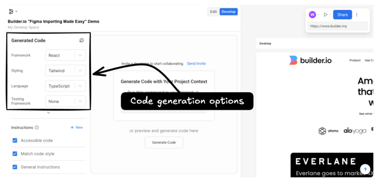
Choose which framework you'd like to use for code generation. Framework options include the following:
- Compose (Beta)
- Email (Beta)
- Flutter (Beta)
- SwiftUI (Beta)
- Angular
- HTML
- Marko
- Mitosis
- Qwik
- React
- React Native
- Solid.js
- Svelte
- Vue
For CSS, you can choose:
- Tailwind
- CSS
- Emotion (React)
- Styled Components (React)
- Styled JSX (React)
Builder-generated styles include clean, contextual class names, CSS variable names that align to your design system, and styled components.
Choose between JavaScript or TypeScript for code generation language.
For testing frameworks, you can choose from Jest or Vitest. You may also choose to have no testing framework as part of the code generation.
Click the down arrow button to display advanced code generation options.
There are two types of generated code output available: Fast and Quality.
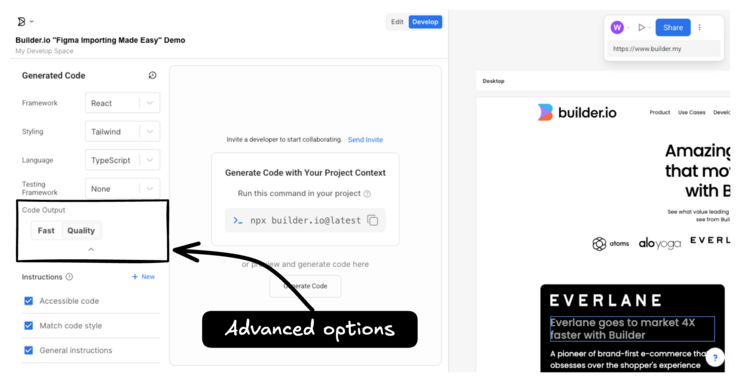
Fast code generations leverage Builder’s proprietary AI model and open-source compiler to nearly instantly turn any Figma design file into high-performing, responsive code for any framework.
Quality code generations enhance fast code generations by adding a fine-tuned AI model that generates clean, semantic code matching developer standards. This feature provides enhanced stability, consistency, optimized response times, and access to the latest model improvements while supporting your framework and styling requirements.
Custom instructions play an exciting role in guiding AI-driven code generation in Builder to produce code tailored to your specific requirements and preferences. You can add instructions in plain, human language so the Generated Code panel uses your preferences as a guide.
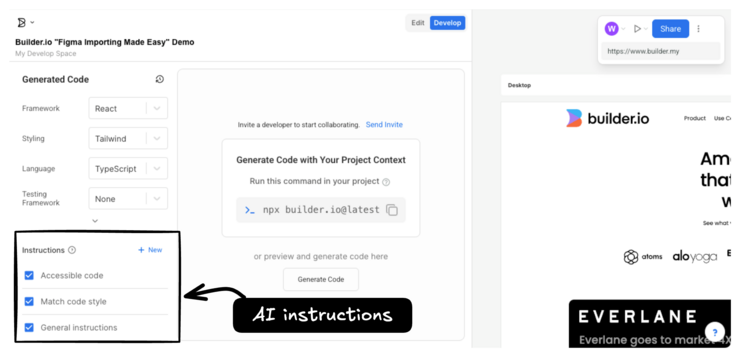
This prompt directs the AI to incorporate HTML accessibility best practices, ensuring compliance with WCAG standards including:
- Semantic HTML tags
- Descriptive alt text for images
- Structured headings
- ARIA attributes
- Keyboard and screen reader accessibility for interactive elements
The result is code that is inclusive and usable for all users.
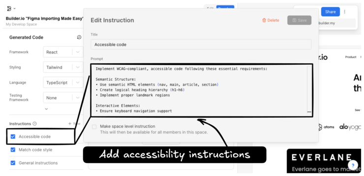
To specify instructions regarding accessibility for generated code:
- In the Visual Editor, click Develop.
- In the Instructions panel, next to Accessible code, click the pencil icon that shows on hover.
- Create or edit the provided custom instructions.
- Click Save.
Make sure that the checkbox next to Accessible code is checked so that your instruction apply during code generation.
Selecting this prompt instructs the AI to closely follow the style of a provided code sample. The AI considers formatting, naming conventions, and stylistic consistency to ensure the generated code feels cohesive. This approach helps maintain consistency throughout the codebase.
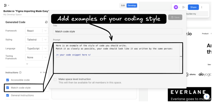
To specify instructions for matching code style:
- In the Visual Editor, click Develop.
- In the Instructions panel, next to Match code style, click the pencil icon that shows on hover.
- Create or edit the provided custom instructions, including example code.
- Click Save.
Make sure that the checkbox next to Match code style is checked so that your instruction apply during code generation.
Here are several examples of different styles of React component that you could use to inform the AI of the preferred output style.
You could provide a basic, clean React style:
// Basic React
function MyComponent({ title, description }) {
  return (
    <div className="my-component">
      <h2>{title}</h2>
      <p>{description}</p>
    </div>
  );
}
Define types inline:
// Using inline type definitions
function MyComponent({ title, description }: { title: string, description: string }) {
  return (
    <div className="my-component">
      <h2>{title}</h2>
      <p>{description}</p>
    </div>
  );
}
Extract type definitions with React.FC:
// Using React.FC with an extracted type definition
type Props = { title: stirng, description: string }
const MyComponent: React.FC<Props> = ({ title, description }: { title: string, description: string }) => {
  return (
    <div className="my-component">
      <h2>{title}</h2>
      <p>{description}</p>
    </div>
  );
}
Apply JSDocs comments:
// Using JSDocs comments
/**
 * Represents the props for MyComponent.
 * @typedef {Object} Props
 * @property {string} title - The title of the component.
 * @property {string} description - The description of the component.
 */

/**
 * MyComponent functional component.
 * @param {Props} props - The props object containing title and description.
 * @returns {JSX.Element} JSX representing the MyComponent.
 */
const MyComponent: React.FC<Props> = ({ title, description }: { title: string, description: string }) => {
  return (
    <div className="my-component">
      <h2>{title}</h2>
      <p>{description}</p>
    </div>
  );
}
This prompt guides the AI to generate code that is clean, concise, and easy to read with descriptive names for variables, functions, and classes, with comments provided for any complex sections.
Adjust this prompt with your own guidelines and suggestions to be incorporated into the code generation process.
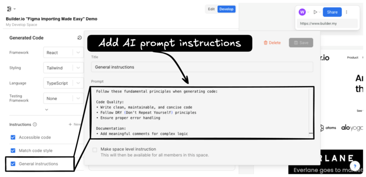
To specify instructions for matching code style:
- In the Visual Editor, click Develop.
- In the Instructions panel, next to General instructions, click the pencil icon that shows on hover.
- Create or edit the provided custom instructions.
- Click Save.
Make sure that the checkbox next to General instructions is checked so that your instruction apply during code generation.
In addition to the prepared suggestions in the app, you can enter any instructions using natural language in the Custom instructions input to provide guidelines for the generated code output. Some examples might include:
- Refactor code into separate components: Request that the AI break down the generated code into multiple components to enhance modularity and code organization.
- Enhance interactivity: Ask the AI to add interactive elements, such as click events or animations, to make the user experience more engaging.
- Incorporate props for maintainability: Instruct the AI to incorporate props into the code structure to make it easier to manage and reuse components across the application.
- Custom styling instructions: Provide detailed styling instructions, including specific CSS classes or styling frameworks, so that the generated code matches your design aesthetic.
- Implement accessibility features: Tell the AI to incorporate accessibility best practices, such as ARIA attributes or keyboard navigation support, to enhance usability for all users.
- Optimize performance: Request optimizations for performance, such as lazy loading of resources or code splitting, to improve the overall speed and efficiency of the application.
- Integrate external libraries or dependencies: Specify the inclusion of external libraries or dependencies required for additional functionality or feature support within the generated code.
- Custom logic or business rules: Provide specific business logic or functional requirements that need to be implemented within the codebase, to align with project objectives.
To learn more about the process of creating code from Figma designs with the Visual Editor, see Generate Code with the Visual Editor. Or, learn more about using your own components during code generation with Map components.


