If you're using Builder.io's Figma to code plugin but finding that your designs aren't converting as well as you'd hoped, the solution might lie in how you're structuring your Figma files. In this guide, I'll show you specific techniques and practical tips that will help you resolve common conversion challenges and get the most out of your Figma to code workflow.
When building responsive, conversion-focused components, it's best to start from the bottom up. Take text elements for example - wrapping them in an auto layout frame with proper padding gives you instant responsive buttons.

This approach works great for calls-to-action (CTAs) and other interactive elements. By using auto layout and setting constraints, you clearly define how elements inside should behave when resized. This solves the common issue of buttons breaking or text overflowing at different screen sizes.
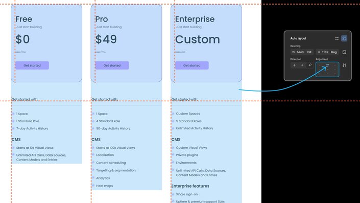
Aligning elements manually can be such a hassle. Thankfully, auto layout makes this process much simpler. Just select your elements and hit Shift+A to add auto layout. Use alignment, margin, and padding settings to perfect the layout.
The best part? Your layouts stay intact even when text content changes. This is crucial for A/B testing different copy variations in Builder.io without breaking your design.
When setting width constraints, consider:
- Fixed width for repeating components like product cards
- Hug contents for buttons and CTAs
- Fill container for text inside fixed width elements
This creates reusable, responsive components while teaching Builder.io your resizing preferences.
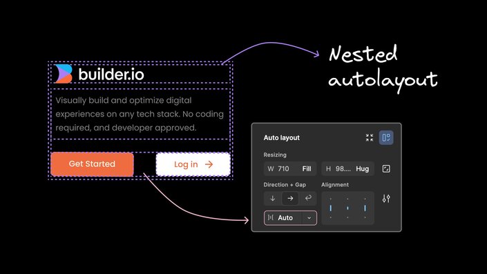
Sometimes you need to group related elements together, like a product image and its description. Nested auto layouts let you create these associations while maintaining responsiveness. This approach helps translate your design intent into code with high fidelity, even as layouts adapt across screen sizes.
Pro tip: Switch space between elements to 'Auto' from the dropdown when you need to automatically distribute equal spacing between all elements within the frame. This makes your layouts even more resilient when converted to code.
You're probably familiar with vertical and horizontal auto layout. But there's a third option that's super handy - wrap.
Use wrap when elements need to switch between horizontal and vertical layouts at different screen sizes. Figma looks at your other constraints and figures out the best arrangement. This is perfect for creating responsive product grids or feature lists that adapt to various devices.
This might seem counterintuitive, but PNGs can sometimes work better than SVGs for responsive layouts, especially when dealing with complex graphics.
With SVGs, spacing between text and image elements is calculated based on one specific frame width. This can lead to funky looking layouts at other sizes.
Using PNGs that scale proportionally with screen width often gives cleaner results across breakpoints, ensuring your key visuals always look great.
Pretty much any arrangement of elements can benefit from auto layout. Product image next to description? Apply auto layout to it.
You can precisely control how images behave at different sizes. Try the new "Lock aspect ratio" feature to keep things looking crisp.
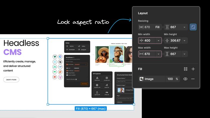
Pro tip: Set min width/height to prevent images from shrinking too much on small screens. This ensures your product shots always look their best.
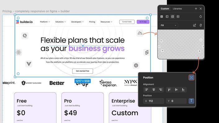
When I first started with auto layout, I got frustrated that I couldn't place elements freely. The strict rules made it impossible to create designs with overlapping elements.
Thankfully, Figma added absolute positioning. This lets you add elements to an auto layout frame without disrupting the existing layout. This is a game changer for creative designs like overlapping testimonial cards or floating CTA buttons.
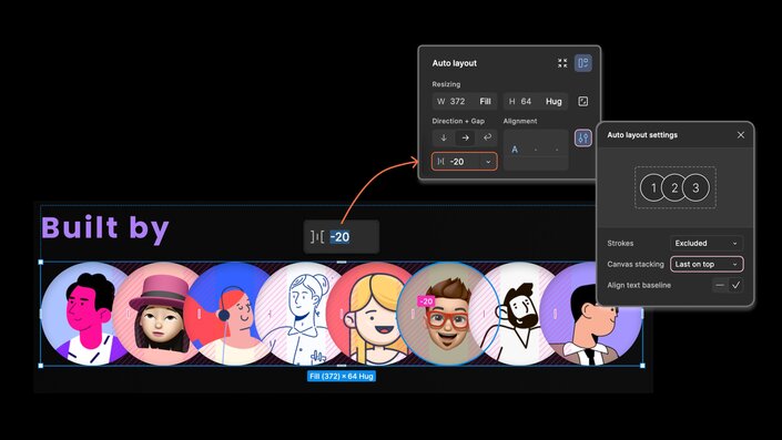
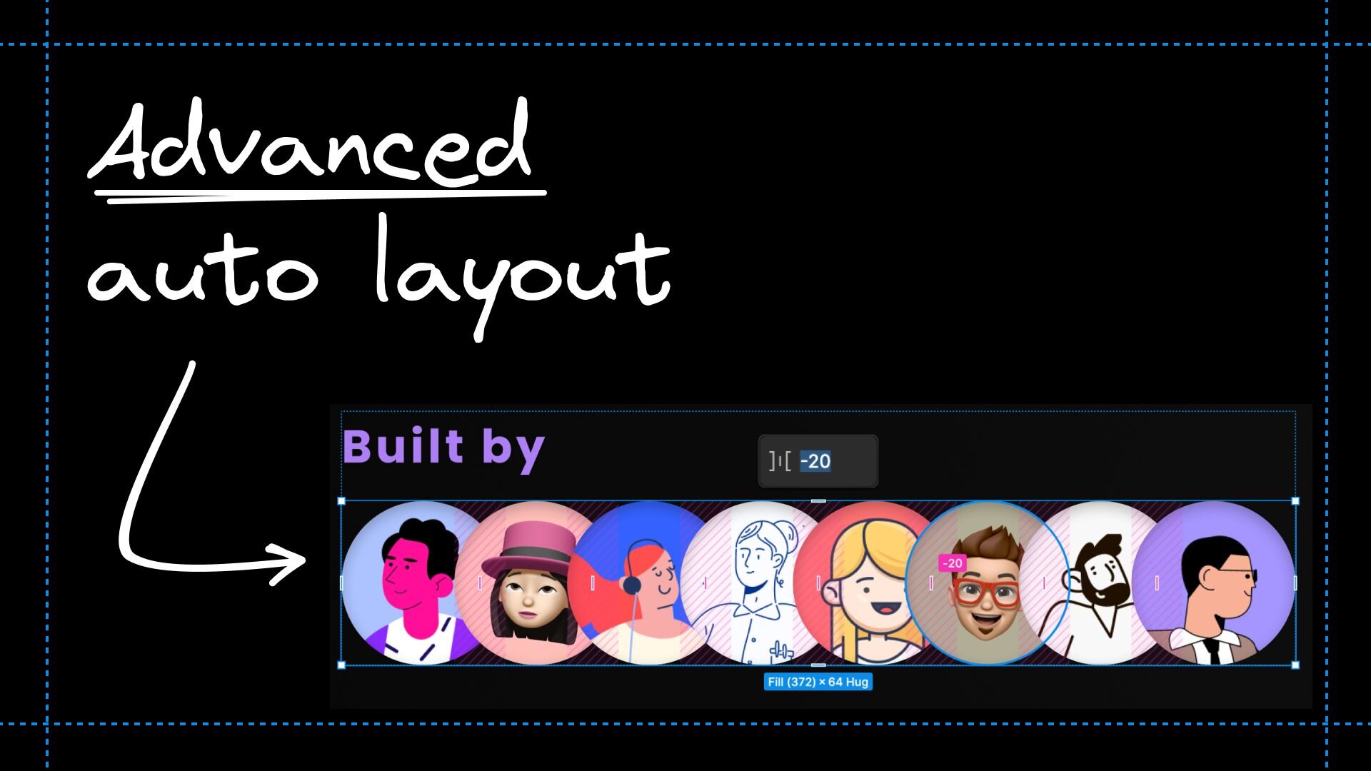
You can achieve some cool effects by playing with auto layout spacing. Try negative horizontal gaps to create overlapping layouts. You can also adjust the stacking order of elements under auto layout settings.
The key is to always start with auto layout. It gives you a flexible foundation to build on and makes it easier for Builder.io to create responsive, conversion-optimized pages.
Auto layout in Figma, paired with Builder.io, is a powerful combo for creating designs that both look great and convert well. By starting small, nesting layouts thoughtfully, and using features like wrap direction and absolute positioning, you can create designs that flex beautifully across all devices.
Want to see how these auto layout techniques can supercharge your Figma to code workflow? Check out this live demo from Builder Labs:
In this video, you'll see firsthand how to:
- Make any design convert better using auto layout
- Style and define images the best way possible
- Work around Builder’s easy and precise mode for importing designs
Watch as we transform static designs into dynamic, conversion-focused components using the power of Figma's auto layout and Builder.io's Visual Copilot.
Builder.io visually edits code, uses your design system, and sends pull requests.
Builder.io visually edits code, uses your design system, and sends pull requests.


 Connect a Repo


